A goodly part of the “strong” economy illusion derives from cherry-picking the hideously misleading numbers contained in the BLS establishment survey’s monthly “jobs” count. As we noted in my previous piece, for instance, the index of hours worked in the high-pay, high-productivity goods-producing sector has actually contracted by 18% since peaking way back in 1978, but that has purportedly been more than off-set by a 128% rise in the hours index for the Leisure & Hospitality (L&H) sector, of which 75% is attributable to bars, restaurants and other food service operations.
Alas, however, what might be termed the “great jobs replacement” caper was not remotely a case of apples-to-apples. The typical part-time, near minimum wage “job” in the L&H sector pays the equivalent $24,400 per year or just 37% of the $66,000 annual equivalent for goods-producing jobs. So in terms of economic throw-weight, or the implied market value of output and income, we have been replacing prime labor force players with what amounts to third-stringers on waivers.
But in some cases, it may actually be even worse than that. To wit, neither the BLS employment data nor the GDP accounts are without systematic bias owing to the fact that they were designed and institutionalized mainly by Keynesian economists on the government payroll. The latter naturally equated economic output and jobs with that which their data framework measured—even as such macro-data was mainly of importance to Keynesian policy makers fiddling with the Washington-based fiscal and monetary dials in an attempt to enhance the greater economic good.
Accordingly, the Keynesian fathers of our contemporary economic data dumps didn’t care much about vast sections of the non-monetized economy including household labor, self-service activities (i.e. doing your own driving, shopping and lawn mowing) and the so-called underground economy conducted in cash and away from the tax collectors, regulators and law-enforcers.
The problem, of course, is that when economic activity migrates from the informal and underground economy to the monetized economy it gets recorded as additional output, jobs and income in our Keynesian labor and GDP accounts. In many such cases, however, no new output or income is actually being generated; it’s just being newly recorded.
For instance, between 2014 and 2023 the number of US taxi and limo drivers more than doubled from 131,800 to 264,600. But we do not believe that activity and employment in this sector actually grew at the implied 8.1% per annum rate. What happened is that the explosion of Uber and Lyft services caused many traditional self-drivers to leave their cars in the garage, and to utilize for-hire drivers instead—even, perhaps, as they played video games on their iPhones in the back seat.
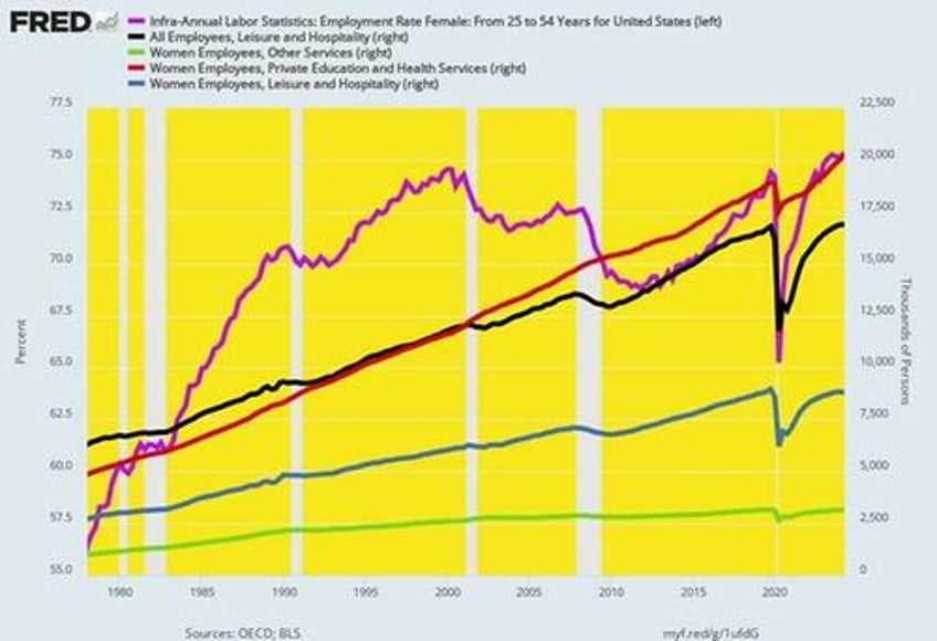
Nor is this illustration a trivial matter. The chart below, in fact, tracks a huge movement of un-measured household activity that has migrated into the monetized and BLS-counted economy since the peak of goods-producing employment back in 1978.
To wit, the employment rate (purple line) for the prime working age female population (25-54 years) rose from 56.5% in Q1 1978 to 75.4% in Q2 2024. Accordingly, the work of nearly one-fifth of the prime age female population moved from the uncounted household economy into the monetized economy during that 46-year span. Self-evidently, however that did not represent new output or jobs but merely the monetization of what was already there.
Moreover, in round job count numbers this migration from the household to the monetized economy was not inconsiderable. During that span the number of prime age women employees in the US rose from 23.5 million in Q1 1978 to 48.9 million in Q2 2024. But nearly half of that 25.3 million gain was due to the rise in the female employment ratio and therefore the counting of jobs that had previously not been recorded.
In the overall scale of the US economy, therefore, these 12.2 million female worker migrations accounted for nearly 20% of the total gain in US employment from 94.8 million in Q1 1978 to 161.2 million at present.
Needless to say, the tracking of this migration of output and jobs to the monetized economy was not simple and linear, such as homemakers becoming cooks in restaurants. In some cases, women historically employed in the household (or men for that matter, too) became doctors who, in turn, employed day care workers to care for their own children and housekeepers to handle the cleaning and laundry.
Still, when you look at the three broad BLS employment categories which are closely related to household work that has become monetized, the migration of female workers from the household economy to the monetized economy is plainly apparent.
Thus, during the 46 years between 1978 and Q2 2024 total US employment grew by 1.16% per annum, which we use as a proxy for the rate of labor input growth in the overall economy. However, women employed in the three leading sectors that absorbed household work, the growth rates were far higher.
46 Year Gains:
Women Employees in Health and Private Education (red line): +15.37 million workers and 3.13% per annum growth.
Women Employees in Leisure & Hospitality: +6.08 million workers and 2.58% per annum growth.
Women Employees in Other Services: +2.17 million workers and 2.54% per annum growth.
In short, the gain of women employees in these three labor market segments alone totaled 23.62 million over 1978 to 2024, thereby accounting for nearly 36% of the total gain in BLS reported employment during the last 46 years. Yet a very substantial portion of the former gain represented neither new economic growth nor new jobs.
Instead, it reflected the sweeping change in social mores during that period and in the role of women in economic life, as they moved into all segments of the paid labor force. At the same time, the household sector, in turn, became a major new employer of paid labor at restaurants, laundries, childcare centers, cleaning services, home health agencies, nursing homes etc. of what had previously been unmonetized household output and employment.
Employment Ratio of Women Aged 25 to 54 Years And Employees in Leisure & Hospitality, Health Care And Private Education and Other Services
The implication is straight forward. The ballyhooed “incoming data” is not all it’s cracked-up to be. Indeed, bringing the analysis exactly to the current state of the US economy, one simple data set needs be noted. To wit, the contrast between the growth of Federal debt since Q4 2019 and nominal GDP tells you all you need to know.
Change Between Q4 2019 and Q2 2024:
Public Debt: +11.63 trillion.
GDP: + $6.75 trillion.
Debt Growth As % Of GDP Growth: 172%.
Of course, the Biden-Harris apologists imply there is nothing to see here—just some big numbers tooling around the page. Or merely a case of Washington at work, helping the macroeconomy to move along at a goodly place.
Not exactly. During the heyday of American prosperity between 1954 and 1970, the public debt grew by a scant 2.2% per annum at a time when nominal GDP was expanding by 6.5% per year. Accordingly, the public debt rose by only 16% of the gain in nominal GDP, the exact opposite of the past four years.
Change Between 1954 and 1970:
Public Debt: +$110.1 billion.
GDP: + 689.0 billion.
Debt Growth as a % of GDP Growth: 16%
Nor did such tepid fiscal stimulus mean that real growth and living standards faltered. During the 1954-1970 period, real final sales grew by 3.75% per annum or by nearly double the 1.93% per annum gain since the pre-pandemic peak in Q2 2020.
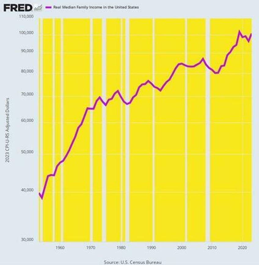
Even more impressively, during the 1954-1970 heyday, real median family income growth far outpaced the last four years as shown below. During the former period, real median family income rose from $38,730 to $65,050 in 2023 dollars or by 3.29% per annum. By contrast, the $101,700 real median family income posted for 2019 clocked in lower at $100,800 in 2023.
Real Median Family Income, 1954 to 2024
The same story holds with respect to total public and private debt. Total debt rose from $558 billion in 1954 to $1.648 trillion in 1970. The resulting gain of $1.098 trillion was just slightly more than the $700 billion rise of GDP during the period.
By contrast, during the 4.5 years between Q4 2019 and Q2 2024 total public and private debt rose from $74.9 trillion to $99.8 trillion. The staggering gain of nearly $25 trillion far-outpaced the $6.8 trillion growth of nominal GDP during the period.
In short, there is nothing organic, natural, sustainable or strong about the GDP numbers currently being posted—notwithstanding all the Biden-Harris boasting to the contrary.
Actually, the US economic is being artificially bloated and levitated by cheap debt compliments of the Fed and other central banks around the world.
As we said at the onset, it has never been true that you can spend, borrow and print your way to prosperity. And the tottering Biden-Harris Economy proves that truism in spades.
* * *
The truth is, we’re on the cusp of an economic crisis that could eclipse anything we’ve seen before. And most people won’t be prepared for what’s coming. That’s exactly why bestselling author Doug Casey and his team just released a free report with all the details on how to survive an economic collapse. Click here to download the PDF now.


