While financial markets continued to enjoy a period of calm, it is an understatement to say that, over the past few weeks, the world has faced turbulent geopolitical and meteorological conditions. As we deal with the impact of wars on portfolio allocations, while consensus continues to daydream about immaculate disinflation, savvy investors know that outside wars, natural disasters are inflationary. They widen budget deficits, disrupt supply chains, and cause temporary surges in demand for certain goods. There is little reason to believe this time will be different, especially when natural disasters occur less than 30 days before the most contested election in US history. In this context, both Kamala Harris and Donald Trump have aimed to be seen as the candidate promising substantial federal aid to the affected regions. This will be particularly true for Harris, given the political backlash the Biden administration faced for its perceived modest response to the damage caused by Hurricane Helene in Georgia and the Carolinas.
https://www.newsweek.com/donald-trump-hurricane-milton-florida-ron-desantis-1967159
One lesson from past hurricanes is the heavy toll they take on cars. More often than not, a flooded car is a totaled car. This is especially true for electric vehicles. A flooded EV in the garage isn’t just a write-off, it’s a potential fire hazard that can spontaneously combust. In the aftermath of hurricanes Helene and Milton, the US may see strong demand for gasoline cars as replacements, while demand for EVs could diminish. Most automakers, however, have positioned themselves to meet the opposite trend.
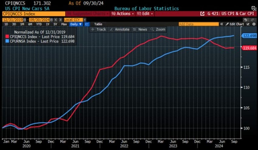
For the US economy, this would mean that the deflation in new car prices reflected in the CPI since March 2023 could be over, and that cars, like other durable consumer goods, could add to external factors that will bring the return of the inflation boomerang sooner rather than later.
US CPI Index (blue line); US New Cars CPI (red line) (rebased at 100 as of December 31st, 2019).
A key lesson from past hurricanes is also that storm damage drives up home and auto insurance premiums, which is already a political issue in states where rising costs are affecting real estate values. In hurricane-prone areas like Florida, residents will face higher insurance premiums and potential local tax hikes. While some cleanup costs may be covered by the federal government, most of the burden for restoring infrastructure, roads, ports, etc., will fall on states and municipalities.
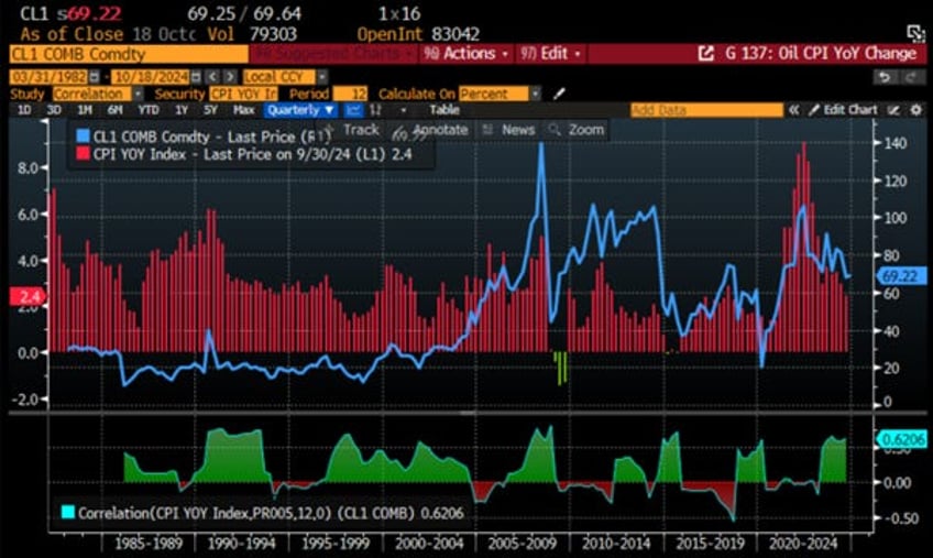
Given this economic backdrop, investors must account for the inflationary impact of the natural disasters, alongside the rebound in oil prices, which, after testing the mid-60s range, are now trending upward and adding to reflationary pressures. These pressures are also fuelled by China's recent stimulus measures and the impact of substantial pay increases secured by US longshoremen to keep East Coast ports open ahead of the ‘D-day’ of the year of political hell (November 5th).
WTI price (blue line); US CPI YoY change (histogram) & Correlations.
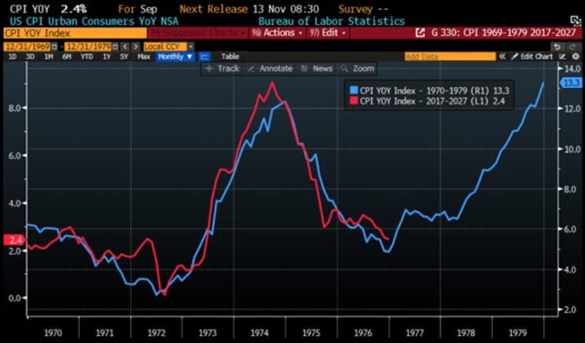
Put all this together, and no one needs a PhD in economics to wonder whether the coming quarters will see US inflation follow the path of the 1970s. What seems to still be missing from the conditions that led to a 1970s-style inflation firestorm is the spark of rising energy prices. Although Russia’s invasion of Ukraine initially triggered fears of natural gas shortages, energy rationing, and grandmothers dying in the cold European winter, none of these dire predictions came to pass. Instead, after a brief panic, energy prices settled into a $70-90/bbl range for Brent crude and a $40-90/bbl equivalent range for European natural gas, where they have remained for most of the past two years.
US CPI YoY Change between 1970 and 1979 (blue line); between 2017 and 2027 (red line).
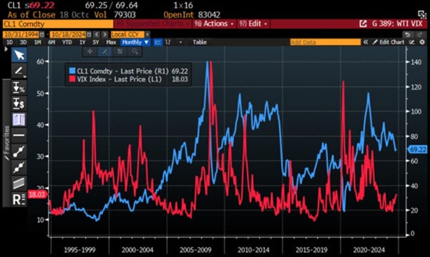
Beyond being inflationary, rising oil prices have historically led to heightened equity market volatility within 3 to 6 months. If oil prices continue to surge amid escalating conflict, market volatility could quickly spike to crisis levels, with the VIX surpassing 40.
WTI price (blue line); Chicago Board Option Exchange Volatility Index (VIX Index) (red line).
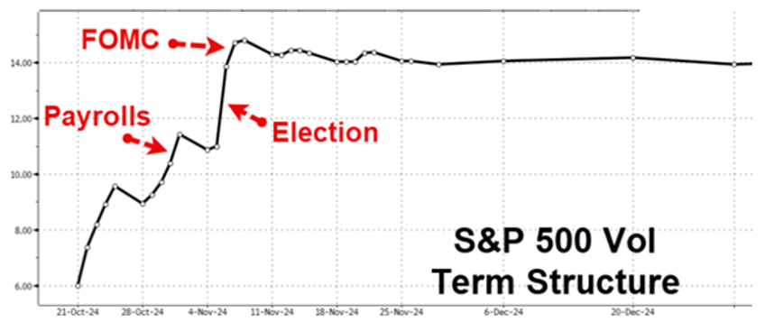
Looking ahead, the volatility term structure is notably upward sloping into Election Day and the coinciding FOMC meeting, indicating that investors should prepare their portfolios for a potential ‘black swan event’ around that time and the period leading into January 6th and the certification of the election.
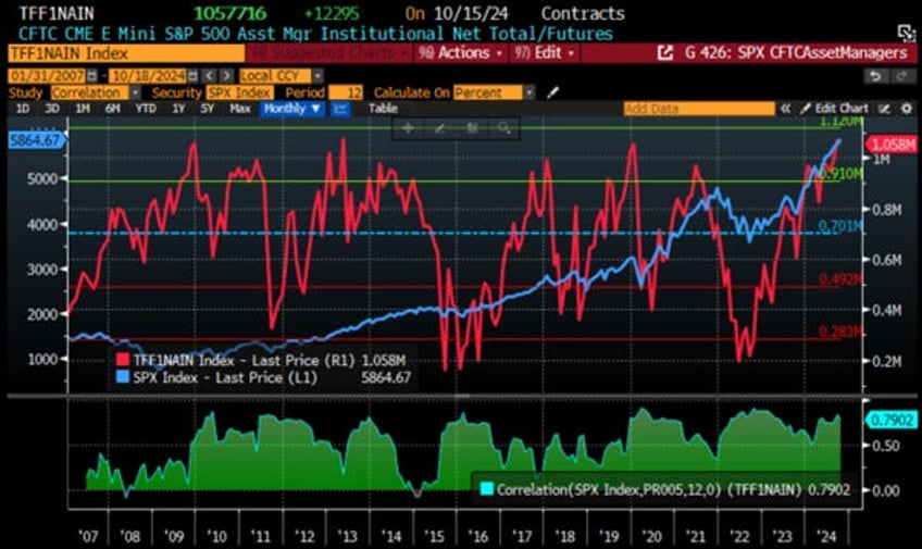
Investors must also remember that Wall Street has a long history of herd mentality, where it's safer to be wrong with the crowd than right alone. With less than 3 weeks until the D-Day of the year of political hell, asset managers haven't been this long on equities (i.e., S&P 500) since January 2020. This should be another reason for anyone with a minimum of common sense to avoid suffering from FOMO while the results of the election could only be announced on January 6th.
S&P 500 index (blue line); CFTC E-Mini S&P 500 Asset Manager Institutional total futures allocations (red line) & correlation.
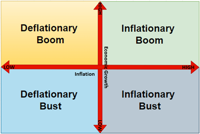
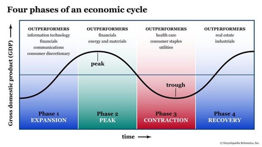
In the current environment, everyone would agree that, like Christopher Columbus navigating through stormy waters to discover the Americas, investors today need a compass more than ever to navigate the turbulent markets ahead. The Schumpeter Business Cycle framework is one of the most reliable ways to map the economic landscape to help investors in their financial navigation journeys. Business cycles can be summarized into four quadrants, akin to the four seasons. The cycle begins in ‘spring’ after a ‘deflationary bust’, driven by rate cuts and fiscal support, leading to growth without immediate inflation. Financial markets thrive in this phase, characterized by a ‘deflationary boom’ and asset rallies, particularly in growth stocks. As the economy moves into ‘summer,’ inflation rises, entering an ‘inflationary boom’ phase where cyclicals, emerging markets, and commodities outperform. However, rising inflation triggers rate hikes, leading to a gloomy ‘inflationary bust’ characterized by stagflation, which negatively impacts most assets except gold. Eventually, inflation slows, and the economy falls into a recession, transitioning into a deflationary bust and the cycle continues.
Historically, researchers and investors have identified a 7-year pattern in economic cycles, potentially linked to the Hebrew tradition of debt forgiveness and land rest (Shemitah). This cycle has been observed in the stock market, with predictions of downturns every 7 years. Notable events often align with this timeframe, influenced by factors such as:
Debt forgiveness and land rest in the Hebrew tradition
Commodity price shocks and interest rate changes
Kondratiev waves (long-term technological cycles)
Juglar cycles (fixed-investment cycles of 7-11 years)
While the 7-year cycle has some empirical support and is neither rigid nor predictable, it remains the best-recognized pattern in the market and economy. Despite ongoing debates about its predictive power and reliability, the 7-year cycle remains the most universally accepted framework for understanding the evolution of the business cycle.
Having spent almost three decades in financial markets, like other strategists, we have been trying to find THE TOOL, or a series of tools, that would show precisely where an economy is in the four-quadrant matrix of the Schumpeter business cycle. After so many years of using official data measuring economic activity and prices, with humility we have to say that we have more or less failed to accurately estimate where the economy stands in this matrix.
In this context, rather than relying on government economic data, which can be easily manipulated for propaganda purposes related to elections and the egos of those in power, it should be clear that market data, rather than government data, are more appropriate for navigating the four quadrants of the business cycle.
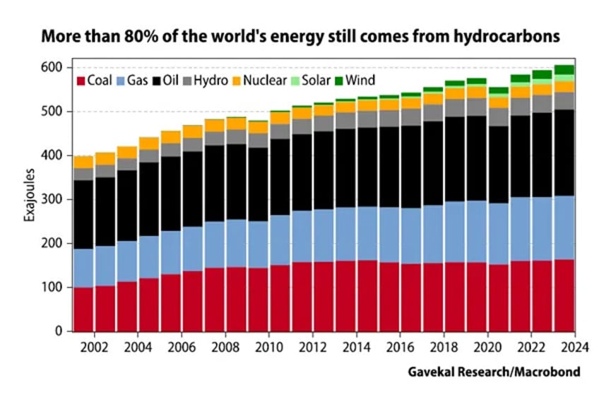
A core principle in analysing a country's economy is that a modern economy can be thought of as energy transformed. Hence, energy is the core economic input, while the outputs are goods and services that should have a higher value than the input. While some are preaching the use of uneconomic ‘green energy’, about 80% of global energy consumption still comes from coal, oil, and natural gas, with prices typically converging around oil, the most easily transported source. Therefore, using the WTI crude contract price provides a reliable proxy for energy cost constraints.
Anyone who has a basic knowledge of economics knows that the output generated from energy input represents the value added by the private sector in the economy. In this context, fluctuations in the market value of this production can be approximated by stock market returns. As every good marginalist, one can assume that as long as stock prices rise faster than oil prices, energy is being transformed productively, leading to natural economic growth. The next obvious question is: what happens if the oil price rises faster than stock market returns? In this scenario, there is a high likelihood that the economy will stop growing, leaving equity investors in a challenging position.
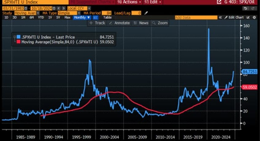
The first proposal for revising the four quadrants is to replace ‘economic activity’ on the vertical axis with ‘energy efficiency.’ To maintain a long-term perspective and avoid noise that could distort analysis, investors should assess whether the an economy, in this case the US economy, is in a boom or a bust not by looking at whether the ratio between the S&P 500 and the oil price is positive or negative, but by comparing the current S&P 500-to-oil price ratio to its seven-year (84-month) moving average. Currently, since this ratio is above its seven-year moving average, it is clear that in the case of the US, the economy remains in a boom.
Ratio of S&P 500 to WTI price (blue line); 84 months Moving average of the S&P 500 to WTI price ratio (red line).
Moving to the old horizontal ‘inflation axis,’ everyone knows that the ‘CPLie’ is a poor indicator of the real inflation that citizens in an economy face. In this context, the key question for investors is not whether prices are going up or down, but whether the bond market is protecting them against rising prices. This leads to the question of whether the bond market is acting as a proper store of value.
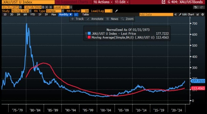
To answer this question, gold is used as a standard of value or unit of account. By computing a ratio between the price of gold in fiat currency and the total return of the government bond index, we can assess fiat currency debasement. If the ratio is below its seven-year moving average, the bond market has been acting as a proper store of value, indicating that the economy must be experiencing a deflationary environment. Conversely, if the ratio is higher than its seven-year moving average, the currency is being debased, suggesting that the economy must be experiencing an inflationary environment.
As history shows for the US, there have been long periods when the US bond market acted as a proper store of value, followed by long periods when gold was a better store of value. Hence, since the start of the decade and the reckless government spending that has followed the onset of the COVID pandemic, the ratio of gold to the Bloomberg US Treasury Index (LUATTRUU index) has been above the 7-year moving average. This confirms, as anyone with a minimum of common sense can see, that despite the prevailing government propaganda, the US economy has been experiencing an inflationary environment.
Ratio of Gold price to US Treasury Index (blue line); 84 months Moving average of the Gold to US Treasury Index ratio (red line).
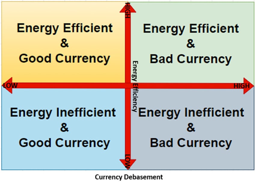
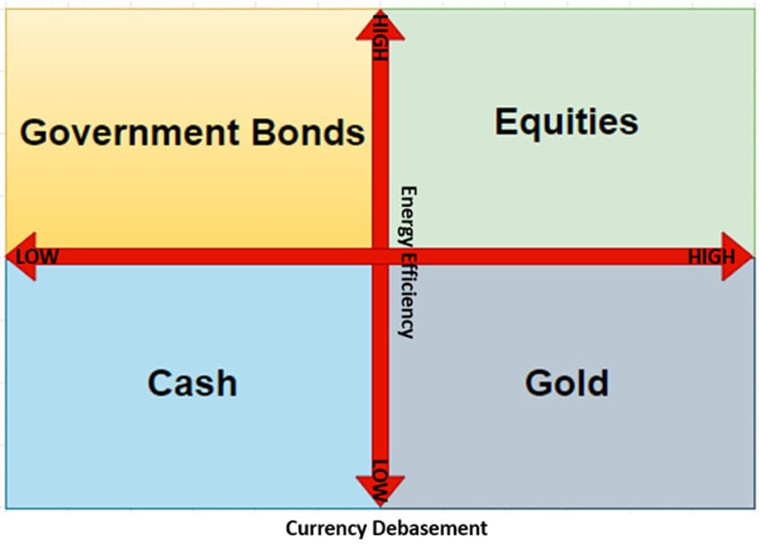
Hence, the two axes that form the backbone of the business cycle can be redrawn based on the energy efficiency of the economy (vertical axis) and the quality of the currency (horizontal axis). The vertical axis will now measure whether the economy is, at that time, energy efficient or energy inefficient. The horizontal axis shows whether the currency is acting as a store of value and is thus labelled as either a ‘good currency’ or a ‘bad currency.’
Therefore, any economy in question can be in one of the following four states:
Energy inefficient/good currency equates to a deflationary bust.
Energy efficient/good currency equates to a deflationary boom.
Energy efficient/bad currency equates to an inflationary boom.
Energy inefficient/bad currency equates to an inflationary bust.
Those familiar with the ‘Browne portfolio’ will remember that the best asset among the four components of the Permanent Portfolio to own in an energy-efficient economy with a bad currency is equities. Equities thrive in such an environment, as they benefit during periods of prosperity and economic expansion. This is probably why the US equity market have been making new all-time highs over the past quarters.
Like the Permanent Portfolio, the analysis of an economy based on its energy efficiency and the quality of its currency can be applied across geographies, making investments much more scalable for investors looking to invest outside their domestic markets.
Read more and discover how to position your portfolio here: https://themacrobutler.substack.com/p/a-compass-to-navigate-stormy-wate…
If this report has inspired you to invest in gold and silver, consider Hard Assets Alliance to buy your physical gold:
https://hardassetsalliance.com/?aff=TMB
At The Macro Butler, our mission is to leverage our macro views to provide actionable and investable recommendations to all types of investors. In this regard, we offer two types of portfolios to our paid clients.
The Macro Butler Long/Short Portfolio is a dynamic and trading portfolio designed to invest in individual securities, aligning with our strategic and tactical investment recommendations.
The Macro Butler Strategic Portfolio consists of 20 ETFs (long only) and serves as the foundation for a multi-asset portfolio that reflects our long-term macro views.
Investors interested in obtaining more information about the Macro Butler Long/Short and Strategic portfolios can contact us at
Unlock Your Financial Success with the Macro Butler!
Disclaimer
The content provided in this newsletter is for general information purposes only. No information, materials, services, and other content provided in this post constitute solicitation, recommendation, endorsement or any financial, investment, or other advice.
Seek independent professional consultation in the form of legal, financial, and fiscal advice before making any investment decisions.
Always perform your own due diligence.


