Investors should by now recognize that the economy moves through business cycles, which can shift from inflationary booms and busts to deflationary ones, typically averaging around seven years over centuries. These investors also know that the permanent portfolio, or ‘Browne Portfolio,’ with its equal weighting in cash, bonds, stocks, and gold, provides relatively stable real returns (inflation adjusted) across these four phases of the business cycle, assuming the country in question is at peace. However, with the turbulent conditions the world has faced since the start of this decade, and though full-scale war has not yet erupted, investors need not only a reliable compass based on market data to navigate these stormy waters but also an antifragile asset.
What is an antifragile asset?
An antifragile asset is an investment that thrives on uncertainty, volatility, and stressors, such as market shocks or crises. Unlike resilient assets that merely withstand stress, antifragile assets gain from it, growing stronger or more adaptable. This concept, developed by Nassim Nicholas Taleb, suggests that antifragile assets do not just survive disorder; they benefit from it.
Characteristics of Antifragile Assets:
Convex Response: Strengthens with increased stress.
Optionality: Gains from unpredictable opportunities.
Asymmetric Payoffs: Potential gains far outweigh potential losses.
Low Fixed Obligations: Reduces fragility risks.
Antifragile assets allow investors to benefit from market turmoil, providing a unique edge in uncertain times.
Many institutional and retail investors in the Western world still view government as the solution to economic problems and see government bonds as safe havens. In contrast, investors in emerging markets recognize the risk of government defaults and understand that only assets like gold, which carry no counterparty risk, truly hedge against reckless government actions and is therefore the ultimate antifragile asset.
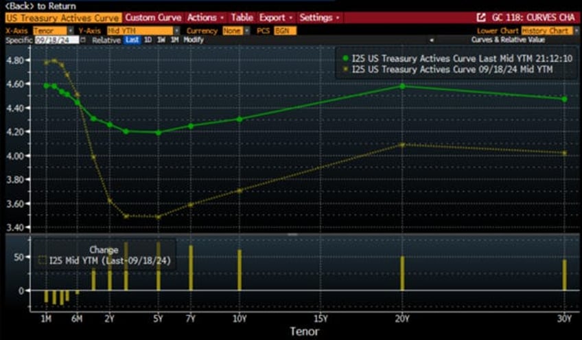
Since the start of the decade, rising debt levels and perceived fiscal laxity have led to surging yields and increased volatility, keeping sovereign bonds under pressure in developed markets. It is therefore no surprise that Bond vigilantes have been active, in particular since September 18th, reminding investors that the Federal Reserve cannot directly control the long end of the yield curve. In an environment where politicians are reluctant to tackle rising government debt, yields remain too low to reflect this new reality.
US Treasury Yield curve as of November 8th, 2024 (orange line); US Treasury Yield Curve as of September 18th, 2024 (green line).
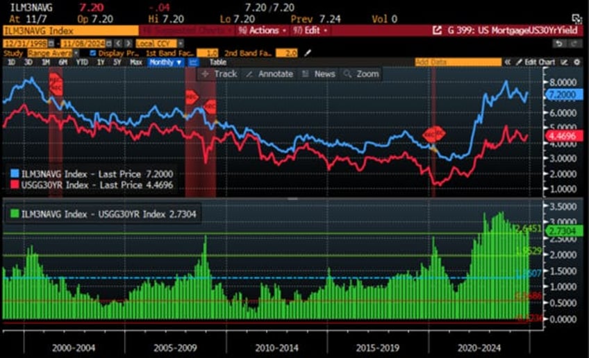
The yield curve matters because everyone knows that in the US, mortgage rates, mostly fixed for a 30-year period, are indexed to the US 30-year Treasury yield. In this environment, while all Wall Street economists were excited about the positive impact of the FED cutting rates in September, the reality for average Americans trying to buy a home as part of the American dream is quite different. They have seen the cost of financing their dream homes increase since September, while banks remain hesitant to lend to borrowers. This has resulted in the largest spread between the US 30-year mortgage and the US 30-year Treasury yield being two standard deviations above its 25-year mean, a level that historically has preceded the US government to declare a recession.
Bankrate 30-year US Mortgage rate (blue line); US 30-Year Yield (red line); Spread between Bankrate 30-year US Mortgage rate and US 30-Year Yield (lower panel; histogram) & US Recessions.
Beyond mortgage rates, the evolution of long-term yields significantly affects the financing costs for US corporations across various credit qualities. Financing costs depend on credit spreads, which must compensate for future defaults. Credit spreads consist of two components:
Default-implied spreads: These provide a forward-looking view on future defaults and recoveries.
Excess spreads: These represent the overcompensation for default risk.
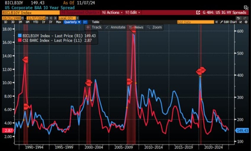
In an environment where investors are justifiably losing trust in government, it should come as no surprise that Investment Grade and High Yield spreads are at historically low levels. While these spreads will inevitably rise during the next economic downturn, investors have come to understand that it is better to lend money to corporations with assets and business models based on a competitive moat than to governments that rely solely on rising taxes to roll over their debt. In short, lending money to a corporation is secured by its assets and expertise, while lending to a government is unsecured. No government lender can sell the Mona Lisa or the Statue of Liberty to recover a loan if the government decides to unilaterally default on its debt or is unable to raise new debt to pay back its old obligations.
US Corporations Investment Grade 10-Year Spread (blue line); US Corporations High Yield 10-Year Spread (red line); US Recessions.
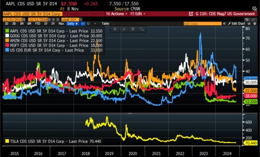
This is likely the reason that, in the new normal of the 2020s, four of the Magnificent Seven are viewed by investors as having better credit risk than the U.S. government itself. Tesla is not far from achieving this particular conundrum, possibly as soon as its CEO becomes part of the US government under a Trump administration.
USD 5-Year CDS of US Government (blue line); Microsoft (red line); Apple (green line); Amazon (orange line); Alphabet (white line); Tesla (yellow line; lower panel).
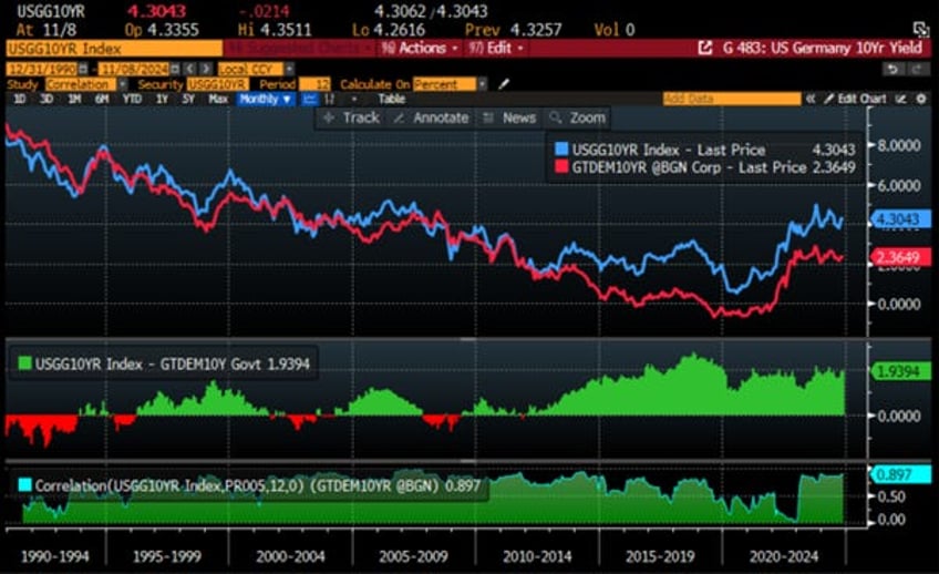
It is not only US corporations which are impacted by higher US treasury yields as other countries which economically and or geopolitically depend on the US and are still using the USD system competes with the US for financing their governments and corporations, higher US treasury yield ultimately also impact yields outside the US, including Europe and other countries remaining in the US sphere of influence .
US 10-Year Yield (blue line); Germany 10-Year Yield (red line); Spread between US 10-Year Yield & Germany 10-Year Yield (histogram middle panel); Correlation (lower panel).
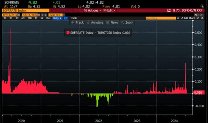
While credit spreads are historically tight, repo rates continue to show signs of stress from time to time, which have historically served as a canary in the coal mine for an impending financial crisis. Indeed, at the end of September, the repo market experienced a glitch and froze due to a sudden shortage of systemic liquidity sparked by the FED's quantitative tightening and declining FED reserve balances (with $3 trillion emerging as a magic number for the Lowest Comfortable Level of Reserves, or LCLoR). As a result, repo rates suddenly spiked to levels last seen during the chaos at the peak of the COVID pandemic. Fast forward to end of October, and the repo mess was back ahead of the election.
US SOFR Secured Overnight Financing Rate – US Treasury RRP Repo Operations Collateral Rate.
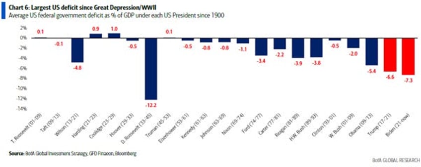
The rise in long-dated government bonds likely reflects the market's recognition that the era of low nominal growth since 2008 is over. Indeed, Biden will be remembered in financial history books for having created the largest US deficit since the Great Depression and World War II, surpassing Trump, who held this unfortunate record from Obama.
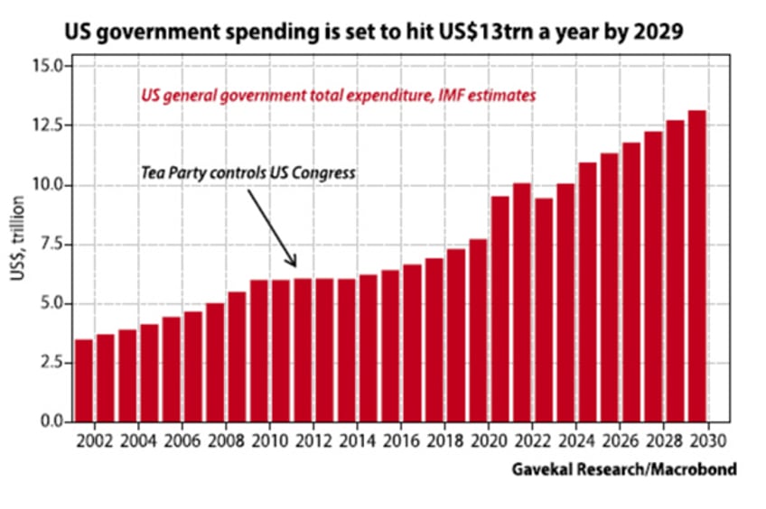
In this context, holding long bonds that yield less than short-term bills makes little sense, leading to the current bond sell-off. However, weak economic data may occasionally attract investors to long-duration bonds. Additionally, rising debt issuance contributes to structurally higher long-dated bond yields. Discussions on reducing the US budget deficit have been absent from the election campaign, and neither candidate has proposed concrete solutions. Meanwhile, US debt is projected to reach $13 trillion annually by 2029, up from $2.5 trillion when Clinton left office, excluding potential additional spending by the 47th US president.
Recently, legendary investors like Paul Tudor Jones, Stanley Druckenmiller, and Leon Cooperman have voiced concerns about the unsustainability of the U.S. fiscal path, signalling a shift in sentiment. Investors now seem more inclined to sell bond rallies rather than buy dips and they are totally right as bonds have been losing their status of antifragile asset.
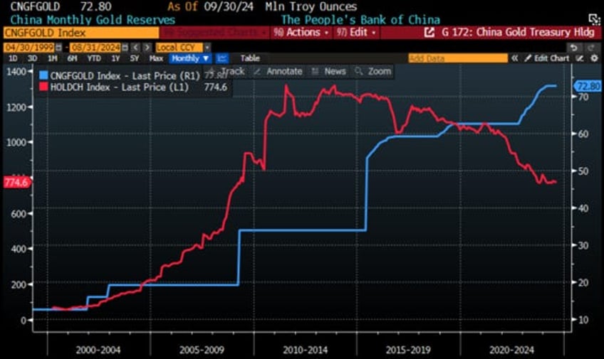
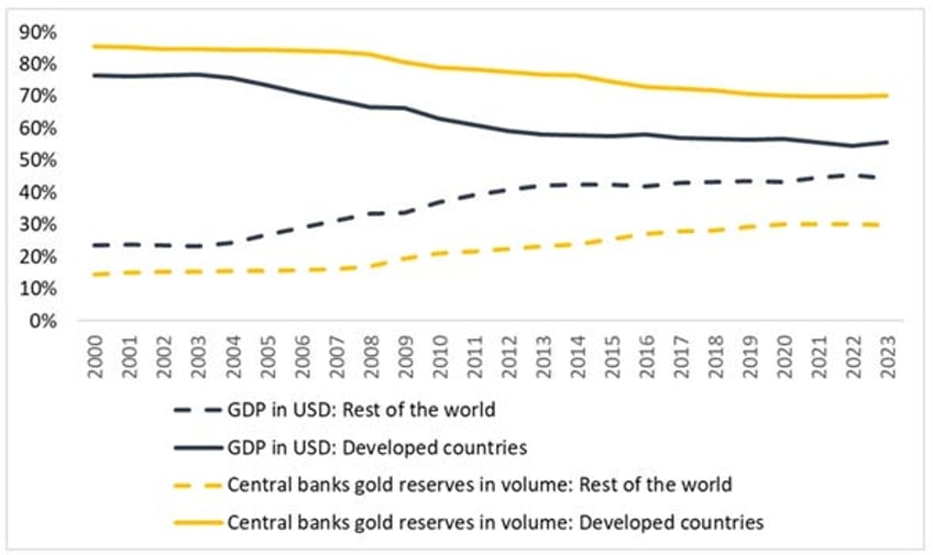
Finally, the shifting geopolitical landscape is unmistakable. The last week of October's IMF meeting in Washington coincided with the BRICS summit in Kazan, likely underscoring the divide between the 'old' Western world and a resurgent Global South. Leaders like Putin, Xi, and Modi have been pushing for ways to de-dollarize trade among the global south countries, build non-SWIFT settlement systems which will make these countries immune from the weaponization of USD assets, and diversify central bank reserves outside the traditional US treasuries. A quick look at the evolution of China's monthly gold reserves and its holdings in US Treasuries over the past 10 years, as no surprise gold reserves have been rising while US Treasury holdings moved in opposite direction.
China Monthly Gold Reserves (blue line); China US Treasury Holdings (red line).
Amid flaws in the USD financial system, gold offers liberation from credit and government risks, as well as from geopolitical decisions such as freezing the assets of countries that do not comply with the US world order. As geopolitical risks rise and trust in public institutions to solve economic and societal issues declines, institutional and, ultimately, retail investors will increasingly focus on assets with no counterparty risks, like gold, which is emerging as the only antifragile asset.
Returning to the business cycle, investors should recognize that relying on government economic data to assess it can be misleading, as such data often serves the political agenda of those in power. Instead, two key market-driven ratios can provide a clearer picture of economic conditions.
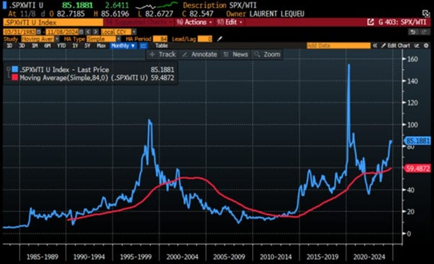
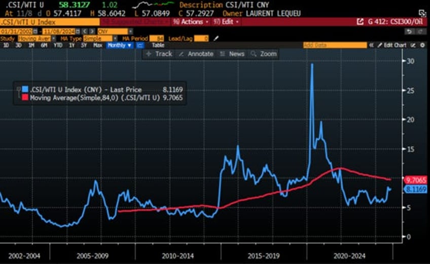
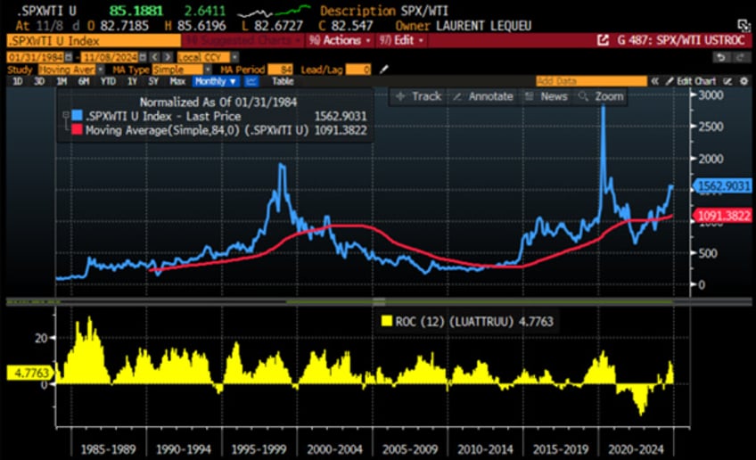
Understanding that the output from energy inputs reflects the private sector's value allows investors to gauge market fluctuations through stock market returns. If stock prices rise faster than oil prices, energy is being used productively, fostering economic growth. Conversely, if oil prices increase more rapidly, economic growth weakens, and the economy enters a bust cycle. Therefore, to determine whether an economy is in a boom or bust, investors need only compare the local market's ratio to oil prices in local currency against its 7-year moving average. A ratio above the moving average indicates a booming economy, as seen in the US currently, while a ratio below suggests a bust phase, as is the case in China today.
Ratio of S&P 500 to WTI price (blue line); 84 months Moving average of the S&P 500 to WTI price ratio (red line).
Ratio of CSI 300 index to WTI price in CNY (blue line); 84 months Moving average of the CSI 300 index to WTI price ratio in CNY (red line).
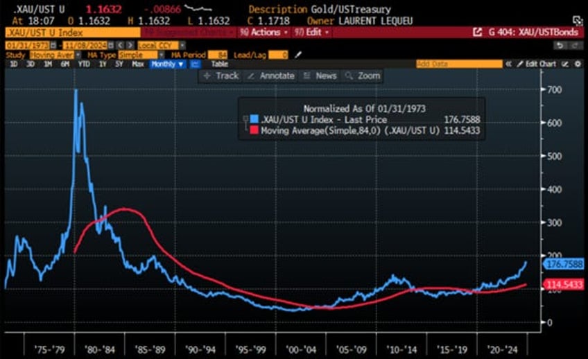
To determine whether an economy is experiencing inflation or deflation, investors should avoid relying on the official CPI data, which misrepresents true inflation levels. Instead, they can assess the quality of a country’s currency by comparing it to gold, the traditional store of value. By calculating the ratio of gold prices in fiat currency to the total return of the government bond index, we can evaluate if the fiat currency is being debased or not and therefore if the local economy is in an inflationary or deflationary environment. A ratio below its seven-year moving average indicates that the bond market is functioning as a store of value, suggesting a deflationary environment. Conversely, a ratio above the moving average implies currency debasement and an inflationary environment.
Historically, the US bond market has acted as a reliable store of value for extended periods, followed by times when gold outperformed. Since the beginning of the decade, particularly due to excessive government spending post-COVID and reckless government’s behaviour, the ratio of gold to the Bloomberg U.S. Treasury Index has remained above its seven-year average. This trend clearly indicates that, despite government narratives, the US economy is experiencing inflation.
Ratio of Gold price to US Treasury Index (blue line); 84 months Moving average of the Gold to US Treasury Index ratio (red line).
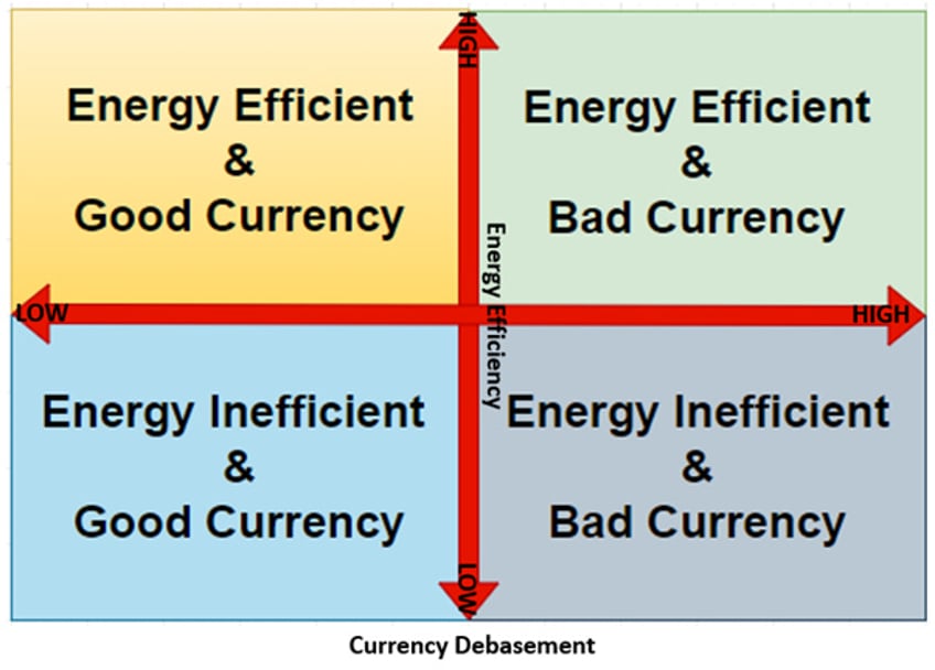
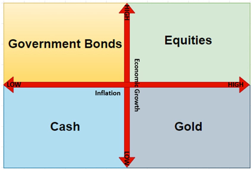
In a nutshell, any economy in question can be in one of the following four states:
Energy inefficient/good currency equates to a deflationary bust.
Energy efficient/good currency equates to a deflationary boom.
Energy efficient/bad currency equates to an inflationary boom.
Energy inefficient/bad currency equates to an inflationary bust.
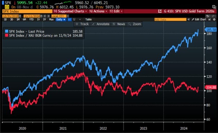
Based on these ratios, the US economy remains in an inflationary boom post-election. However, investors should recognize that this fiat currency-based model can create a monetary illusion. To address this, they should assess the S&P 500's performance in gold terms instead of USD. While rising wages or asset values may make people feel wealthier, inflation often undermines real purchasing power, distorting financial reality. A comparison since the start of the decade reveals that the S&P 500 has risen nearly 80% in USD terms but has actually declined by 2.8% when measured in gold. This indicates that much of the stock market's gains are due to USD debasement rather than genuine economic strength, reflecting a monetary illusion rather than robust performance.
Performance of $100 invested in the S&P 500 index (blue line) and the S&P 500 index valued in gold terms (red line) since December 31st, 2019.
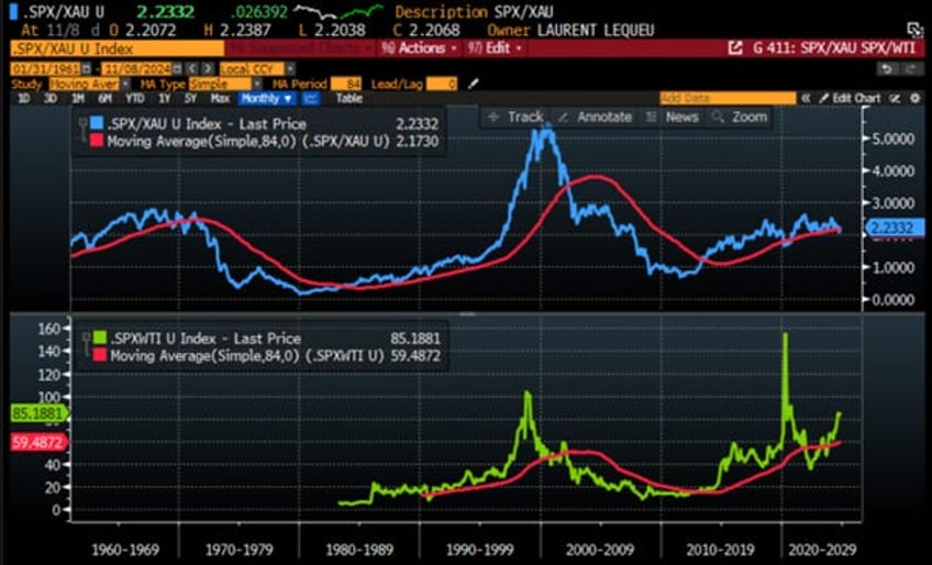
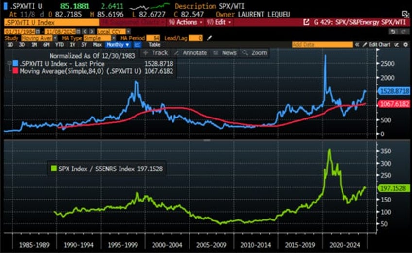
To tackle this monetary illusion in any country, investors should by now have understood that they should also look at the ratio between the local stock market and the price of gold in local currency. If the ratio is below its seven-year moving average, the stock market is likely boosted by the effects of monetary illusion, which has historically indicated that an economy is about to transition from a boom phase to a bust phase. Conversely, if the ratio is above its seven-year moving average, the stock market performance is not driven by monetary illusion, suggesting that the economy, if not already in a boom, is poised to move from a bust phase into a boom phase. At the end of October, before American banked their vote, the S&P 500 index to gold ratio fell below its seven-year average. While this ratio rebounded post-election, the recent evolution of this ratio has seldom been a good omen for the U.S. economy. This trend has historically preceded economic downturns, and in this case, it is likely to lead to an inflationary bust.
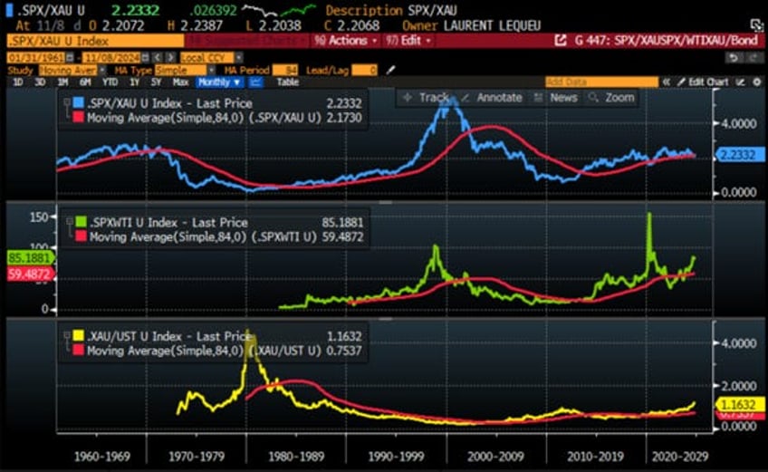
Upper Panel: S&P 500/Gold ratio (blue line); 84 months Moving Average of the S&P 500/Gold ratio (red line); Lower Panel: S&P 500/WTI ratio (green line); 84 months Moving average of the S&P 500/ WTI ratio (red line).
In a nutshell, while the US is still in an inflationary boom, the fact that the S&P 500 index to gold ratio is struggling above its seven-year moving average indicates that the economy is likely to transition into an inflationary bust sooner rather than later. This impending inflationary bust will most likely be triggered by inevitable escalating conflict in the Middle East, as anyone with a basic understanding of how Washington operates and who really holds power has a vested interest in perpetuating the forever bankers' wars.
Combining the business cycle with the Browne Permanent Portfolio, we see that in an inflationary boom, investors should overweight equities and underweight the other three asset classes in the portfolio. Conversely, in an inflationary bust, investors must overweight gold relative to the other asset classes.
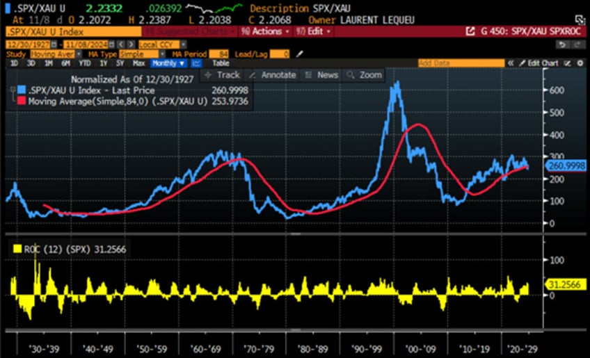
Indeed, a look back at history shows that when the S&P 500 to gold ratio crosses below its 7-year moving average, this event is typically associated with the peak of the 12-month rate of change in the S&P 500 index for that cycle.
Upper Panel: S&P 500/Gold ratio (blue line); 84 months Moving Average of the S&P 500/Gold ratio (red line); Lower Panel: S&P 500 index 12-month rate of change (yellow histogram).
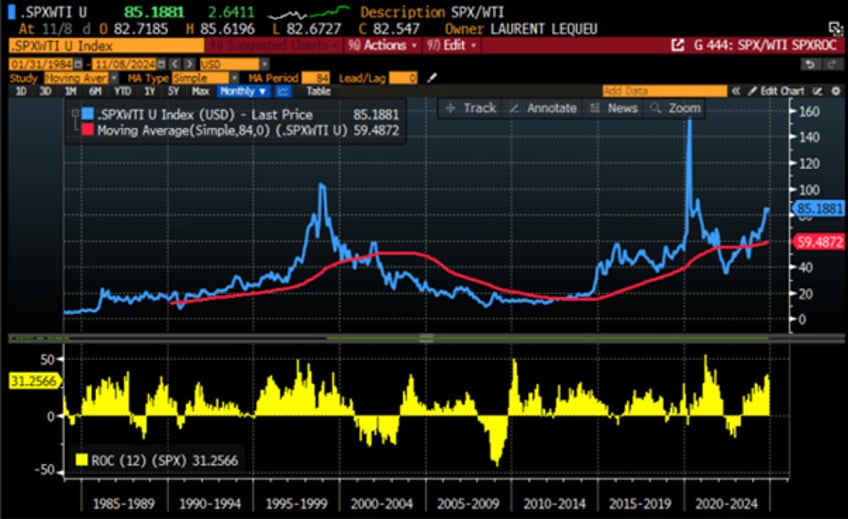
In this context, investors should also note that once the S&P 500/WTI ratio breaks below its 7-year moving average, historically occurring 3 to 9 months after the S&P 500 to gold ratio breaks its 7-year moving average, every equity rally should be sold.
Upper Panel: S&P 500/WTI ratio (blue line); 84 months Moving Average of the S&P 500/WTI ratio (red line); Lower Panel: S&P 500 index 12-month rate of change (yellow histogram).
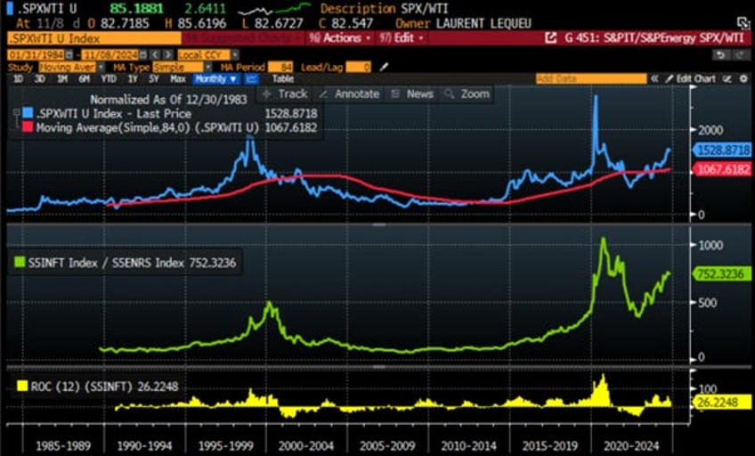
Once the business cycle reaches this point, the IT sector, serving as a proxy for energy consumers, should stop outperforming the energy sector, which represents energy producers. This shift is likely to be accompanied by a significant drawdown in the IT sector, consistent with recent historical patterns.
Upper Panel: S&P 500/WTI ratio (blue line); 84 months Moving Average of the S&P 500/WTI ratio (red line); Middle Panel: Relative Performance of S&P 500 IT sector to S&P 500 Energy sector (green histogram); Lower Panel: S&P 500 IT index 12-month rate of change (yellow histogram).
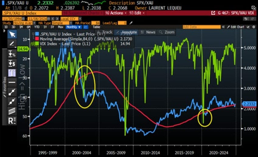
In this context, investors should already understand that the recurring underperformance of the S&P 500 versus gold indicates that recent equity gains are largely due to monetary illusion and currency debasement rather than economic strength. Every time the S&P 500/XAU ratio drops below its 7-year moving average, volatility spikes significantly. Since this pattern in the S&P 500 versus gold ratio has consistently been a bad omen for the economy and, ultimately, for equity investors, this should not come as a major surprise to anyone.
S&P 500/Gold ratio (blue line); 84 months Moving Average of the S&P 500/Gold ratio (red line); CBOE Volatility Index (VIX Index) (axis inverted; green line).
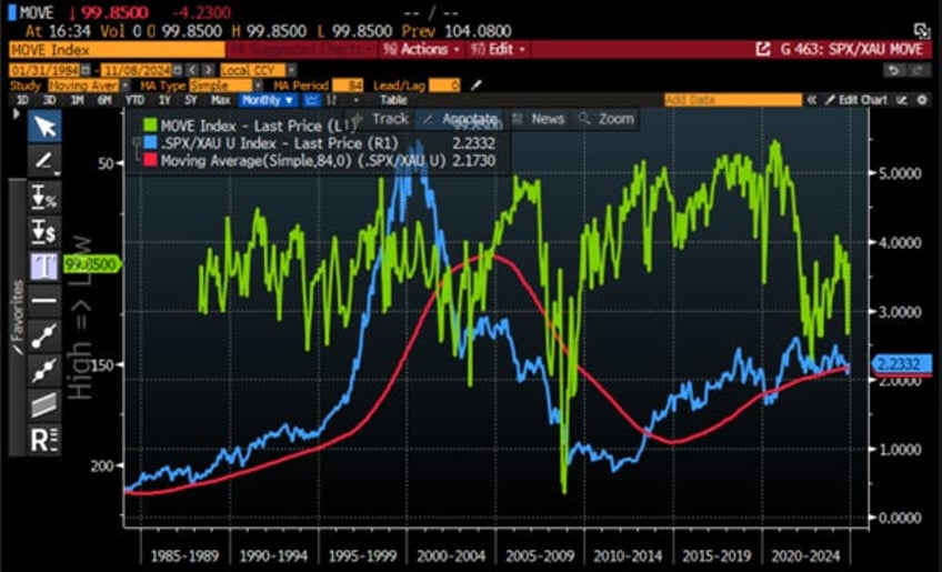
The same is true for the bond market: when the S&P 500 to gold ratio breaks below its 7-year moving average, as it did a few weeks ago, it typically signals a period of significantly higher volatility in the bond market. This aligns with the common-sense belief that the bond market is already sniffing that the upcoming period of inflationary bust will not be an ideal time to invest in either long-dated bonds and equities.
S&P 500/Gold ratio (blue line); 84 months Moving Average of the S&P 500/Gold ratio (red line); ICE BofA MOVE Index (axis inverted; green line).
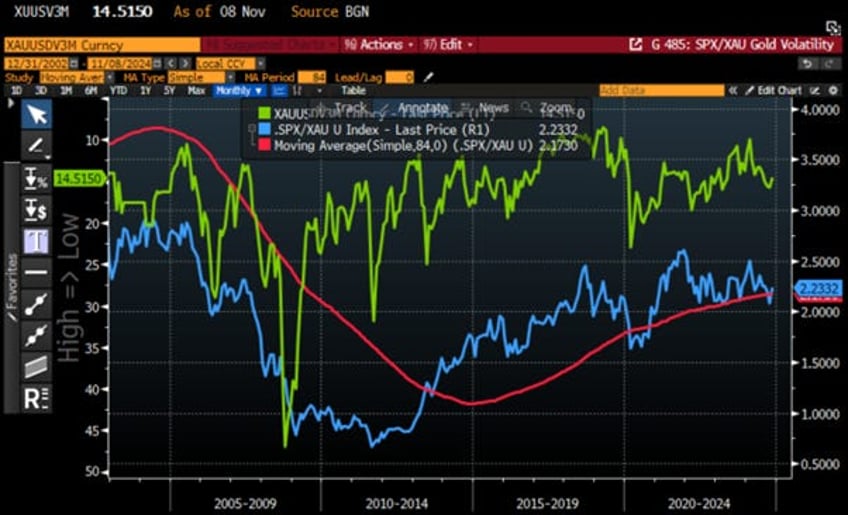
Gold volatility is also impacted by the S&P 500 to gold ratio breaking below its 7-year moving average as it was particularly the case during the Great Financial Crisis of 2008-2009 and the Covid flash crash of early 2020.
S&P 500/Gold ratio (blue line); 84 months Moving Average of the S&P 500/Gold ratio (red line); XAU-USD 3-month ATM implied volatility (axis inverted; green line).
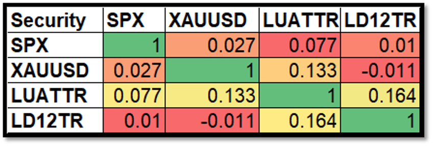
n an environment of rising volatility across asset classes, investors should increasingly look for antifragile assets to include in their portfolios, not only for diversification in the next phase of the business cycle but also to reduce drawdowns in general. To assess the quality of an asset as antifragile, investors can examine not only its correlation with other asset classes but also its volatility. A review of the correlation matrix of the four asset classes in the Browne portfolio shows that since 1980, the assets with the lowest monthly correlation to the S&P 500 have been gold and cash, not government bonds. With cash being debased by reckless government’s behaviours, this should already been a reason for investors to overweight gold versus bonds in the past.
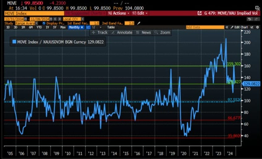
Given the statistical issues related to the computation and use of correlation, investors researching antifragile assets should focus more on the volatility of the asset class they consider rather than on correlations. In this regard, a quick look at the ratio between the bond volatility index (proxied by the MOVE Index) and gold volatility (proxied by the XAU/USD 3-month ATM implied volatility) shows that since the start of the current decade, this ratio has been moving structurally higher and is now again at one standard deviations above its 20-year average, as it was in 2022 and 2023.
Ratio between the ICE BofA MOVE Index and the XAU-USD 3-month ATM implied volatility rebased at 100 as of December 31st, 2004.
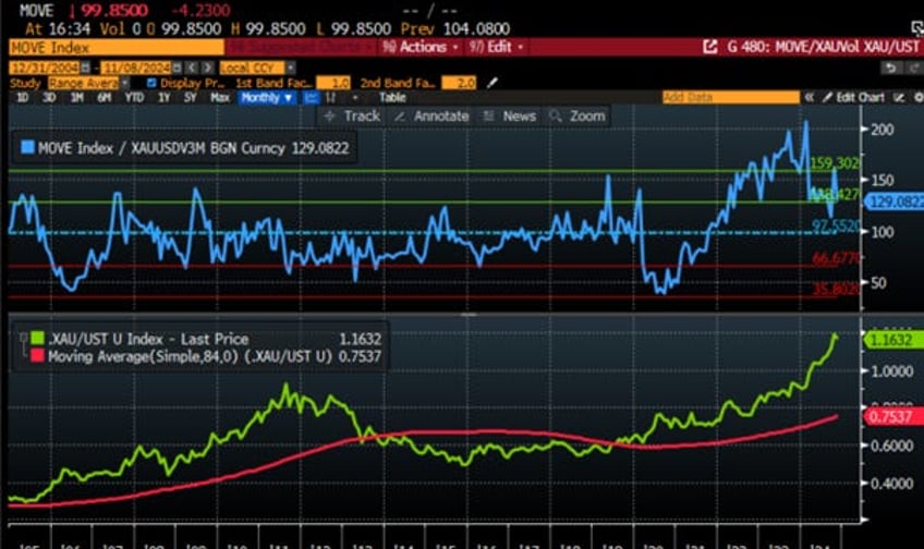
It should not escape any investor that the trend in this ratio is highly correlated with the evolution of the gold-to-U.S. Treasury bond ratio, which everyone should now recognize as an indicator of the quality of fiat currency as a store of value compared to the ancestral store of value, which is physical gold. The relative rise of bond volatility against gold volatility indeed seems to occur especially when the gold-to-bond ratio crosses above its 7-year moving average. In such scenarios, the currency debasement experienced inevitably makes bondholders more nervous about owning government bonds. Any investor with a minimum of common sense knows that to preserve their wealth from an inflationary orchestrated default organized by the governments, they should stop lending to those same governments and should instead store their wealth in physical gold, as it has been the case since the start of the decade.
Upper Panel: Ratio between the ICE BofA MOVE Index and the XAU-USD 3-month ATM implied volatility rebased at 100 as of December 31st, 2004; Lower Panel Gold to US Treasury Ratio (green line); 84-month Moving Average of Gold to US Treasury Ratio (red line).
This is even more true in an environment where the US government has decided to weaponize USD assets by freezing USD-denominated assets owned by foreign governments that do not align with the global order as preached by Washington. This is why everyone understands that the ongoing de-dollarization of the world economy has been largely motivated by the weaponization of USD assets and the endless wars perpetuated by Washington warmongers to impose their unipolar world view. Any country, most in the world ex-developed, with a different view of the world order and a minimum of common sense will, in this environment, continue to favour physical gold over US government bonds as a way to store its reserves, opting to keep its gold in its own central bank vaults rather than in the vault of the New York Federal Reserve.
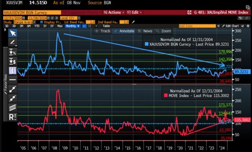
A look at the XAU-USD 3-month ATM implied volatility over the past 20 years shows a structural decline since the 2008 Great Financial Crisis, with only some episodic spikes during crises such as the 2011 Black Monday crisis and the 2018-2019 taper tantrum. However, one does not need to be an options trader to notice that, over the past 20 years, gold volatility, which currently trades below its 20-year average, has been declining structurally, while bond volatility (proxied by the MOVE Index), which trades above 1 standard deviation above its 20-year average, has been structurally increasing, especially since the start of the decade.
XAU-USD 3-month ATM implied volatility (blue line); ICE BofA MOVE Index (red line) rebased at 100 as of December 31st, 2004.
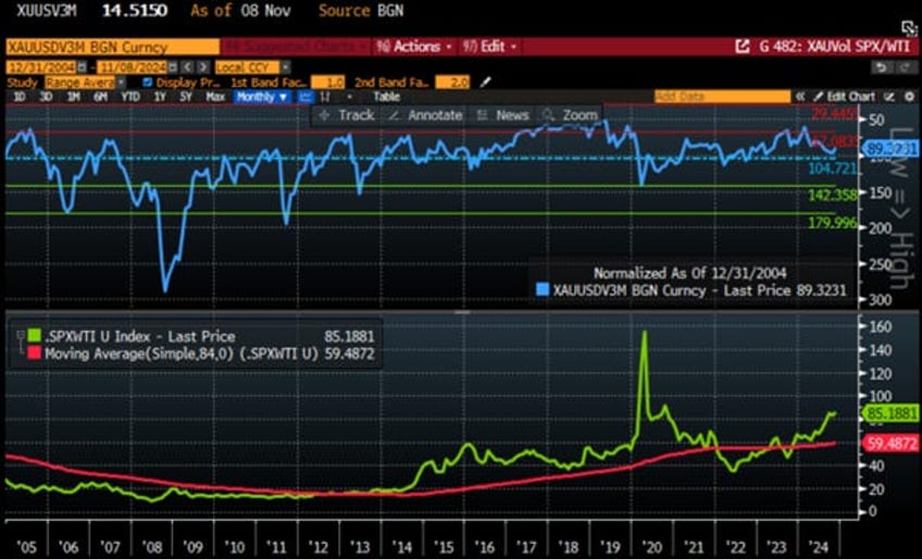
This structural decline in implied physical gold volatility is most likely related to the fact that, since the start of the decade, the government and central banks have done a poor job of maintaining the USD as a good store of value. They have both chosen to use inflation as a means to default on their reckless government spending. With no signs of the government stopping this reckless behaviour, and while a direct default will remain unlikely until the US Treasury and the FED find ways to roll over the government debt, investors should expect the USD to continue to be a poor store of value. Despite the official rhetoric proclaiming that the fight against inflation is ‘mission accomplished,’ the inflationary environment is likely to persist, with the gold to US Treasury Index expressed in USD terms continuing to trade well above its 7-year moving average. With the perspective of the S&P500 to WTI ration to trade sooner rather later under its 7-year moving average, investors should anticipate even lower gold volatility in the foreseeable future as it has been the case between 2005 and 2013.
XAU-USD 3-month ATM implied volatility (axis inverted blue line); rebased at 100 as of December 31st, 2004; Lower Panel S&P 500 to WTI ratio (green line); 84-month Moving Average of S&P 500 to WTI Ratio (red line).
In a nutshell, as the US has been in an inflationary environment since the start of the decade and with the S&P 500 to gold ratio recently struggling just above its 7-year moving average, an event that has historically indicated a transition from a boom period to a bust period within the next 3 to 9 months, investors should increasingly consider raising their allocation to antifragile assets. While Wall Street bankers and their parrots continue to promote government bonds as the antifragile asset that will protect them in the next economic downturn, the reality understood by those analysing market indicators and historical data is that gold, not bond is and will be the antifragile asset to own in a diversified portfolio, as government bonds are becoming a toxic asset to avoid for those looking to preserve their wealth in a structurally more inflationary environment.
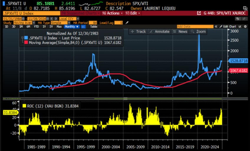
Outside volatility, what matter is returns for investors. On that matters investor will take note that over the past 40 years, every time the S&P 500 to WTI ratio broke below its 7-year moving average , the 12 months rate of return of gold has outpaced the 12-months rate of return of US Treasuries as it was the case from 2002 until 2012 and from end of 2021 until end of 2023.
S&P 500 to WTI ratio (blue line); 84-month Moving Average of S&P 500 to WTI Ratio (red line); Gold price in USD terms 12-months rate of change (lower panel; yellow histogram).
S&P 500 to WTI ratio (blue line); 84-month Moving Average of S&P 500 to WTI Ratio (red line); Bloomberg US Treasury Total Return in USD terms 12-months rate of change (lower panel; yellow histogram).
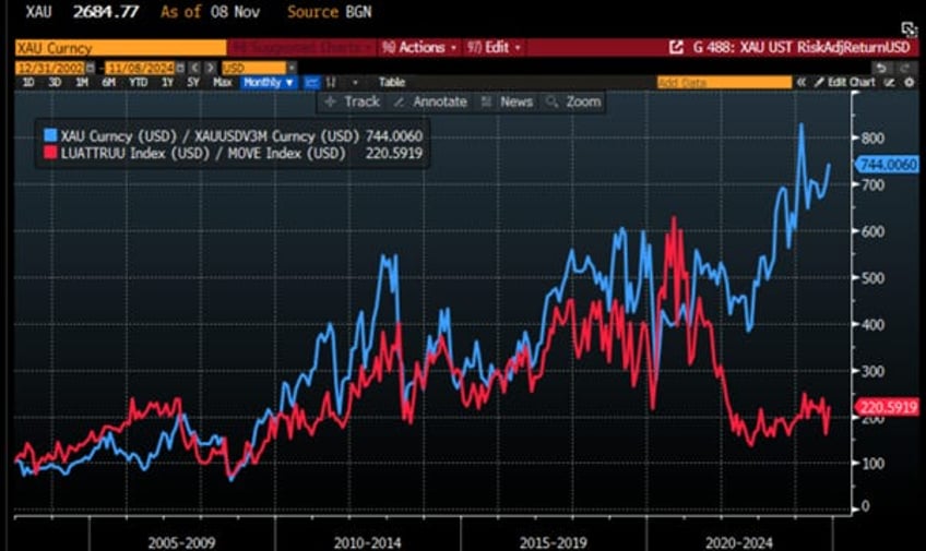
For those who are not yet convinced that gold offers a better risk-adjusted return than treasuries, examining the performance of gold and US Treasuries in USD terms, adjusted for their respective volatility, should dispel any lingering doubts that gold, not US Treasuries, is the only antifragile asset to own in portfolios. This reality has become particularly evident since the start of this decade.
Performance of $100 invested in physical gold adjusted to its implied volatility (blue line); in Bloomberg US Treasury Total Return index adjusted to its volatility (red line) since 31st December 2002.
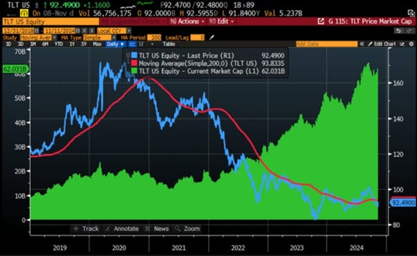
However, this reality seems to have been forgotten by wall street and also retail investors, who are often misguided in their financial decisions by bankers and mass media that do not prioritize the financial interests of their clients and audiences. Over the past few years, a good proxy for retail investor interest in long-dated bonds has been the iShares 20+ Year Treasury Bond ETF (TLT US). In the context of once again rising long-dated yields, the ETF is trading below its 200-day moving average and is on track for its fourth consecutive year of negative price returns. This sell-off does not reflect a lack of retail investor enthusiasm for US bonds; quite the contrary. As US Treasuries pulled back, flows into TLT soared, causing the ETF’s market cap to rise from $10 billion in 2019 to $60 billion today.
iShares 20+ Year ETF (TLT US) (blue line); iShares 20+ Year ETF (TLT US) 200 days Moving Average (red line); iShares 20+ Year ETF (TLT US) Market Cap (green histogram).
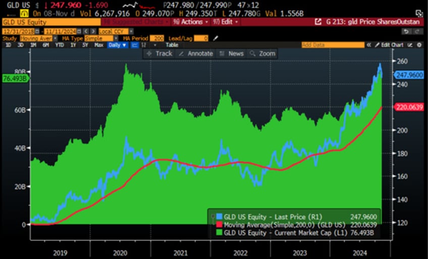
On the other hand, the SPDR Gold Shares ETF (GLD US), which serves as a proxy for the interest of US retail investors who are too lazy to manage the physical storage of their own gold, has been trading above its 200-day moving average since late October 2023. However, its market cap remains below its all-time high of $84.0 billion, reached in August 2020. This suggests that ‘YOLO’ investors, easily influenced by Wall Street and its media advocates, have been selling the rips in gold while buying the dips in bonds and that they have yet to recognize that gold, rather than government bonds, should be prioritized for the upcoming economic environment.
SPDR Gold ETF (GLD US) (blue line) SPDR Gold ETF (GLD US) 200 days Moving Average (red line) SPDR Gold ETF (GLD US) Market Cap (green histogram).
In conclusion, as all data indicates that as the US economy moves slowly but surely from an inflationary boom into an inflationary bust, gold, not government bonds, is the antifragile asset to own. Despite the misleading rhetoric spread by Wall Street bankers and their advocates, who have encouraged investors to continue buying the dips in long-dated government bonds and selling the rips in the barbaric relic, as always, investors should continue to do the opposite of what ‘Government Sachs’ and its peers advise to do : Sell the rallies in fixed income assets and buy the dips in Gold.
Investors must always remember that government bonds and cash are contracts where the sovereign state issuing these contracts has the right to unilaterally and sovereignly alter the terms to serve its own interests, which are unlikely to align with those of the contract holders. In contrast, gold is a property with the unique advantage of having no counterparty risk, a privilege that will be invaluable when investors increasingly prioritize the Return OF Capital over the Return ON Capital.
Read more and discover how to position your portfolio here:https://themacrobutler.substack.com/p/gold-not-bonds-as-antifragile
If this report has inspired you to invest in gold and silver, consider Hard Assets Alliance to buy your physical gold:
https://hardassetsalliance.com/?aff=TMB
At The Macro Butler, our mission is to leverage our macro views to provide actionable and investable recommendations to all types of investors. In this regard, we offer two types of portfolios to our paid clients.
The Macro Butler Long/Short Portfolio is a dynamic and trading portfolio designed to invest in individual securities, aligning with our strategic and tactical investment recommendations.
The Macro Butler Strategic Portfolio consists of 20 ETFs (long only) and serves as the foundation for a multi-asset portfolio that reflects our long-term macro views.
Investors interested in obtaining more information about the Macro Butler Long/Short and Strategic portfolios can contact us at
Unlock Your Financial Success with the Macro Butler!
Disclaimer
The content provided in this newsletter is for general information purposes only. No information, materials, services, and other content provided in this post constitute solicitation, recommendation, endorsement or any financial, investment, or other advice.
Seek independent professional consultation in the form of legal, financial, and fiscal advice before making any investment decisions.
Always perform your own due diligence.


