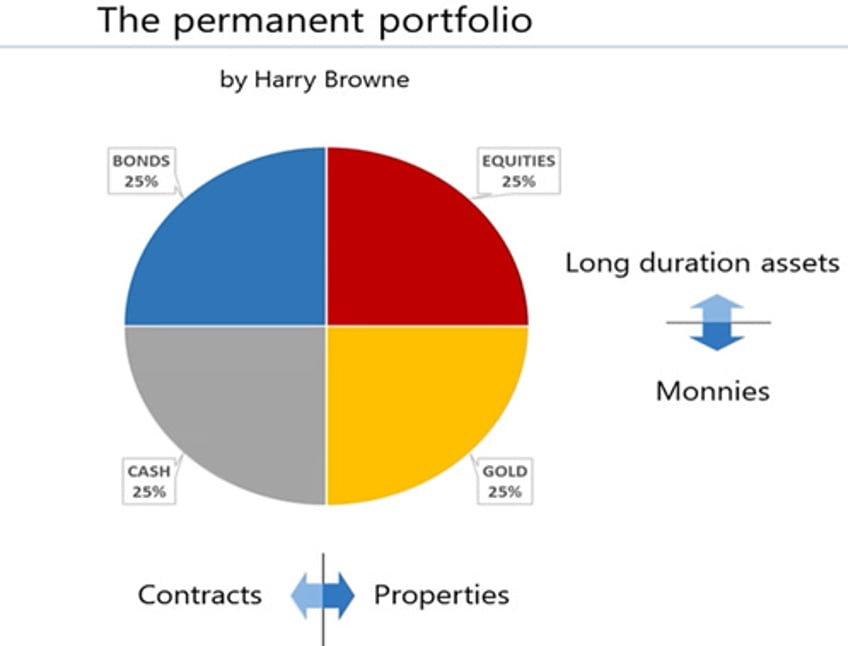
Among the four asset classes that compose the Permanent Brown Portfolio, bonds are probably the least understood by most retail investors, as they have historically been the domain of institutional investors.
A bond is a type of investment security in which an investor lends money to a borrower (typically a corporation or government entity) for a fixed period, known as the bond’s term or maturity. In return, the borrower agrees to pay the investor a fixed rate of interest, called the coupon rate, and to repay the principal amount (face value) upon the bond’s maturity. In a nutshell, bonds are contracts with much longer maturities than cash.
Bonds are fixed-income instruments where investors lend money to governments or corporations to fund various initiatives. As one of the main asset classes, bonds specify loan terms, interest payments (coupon rate), and a maturity date for principal repayment. Issued at par value (typically $1,000), their market price fluctuates with credit quality, time to maturity, and interest rate trends. Bondholders earn returns through interest payments and the principal repayment at maturity.
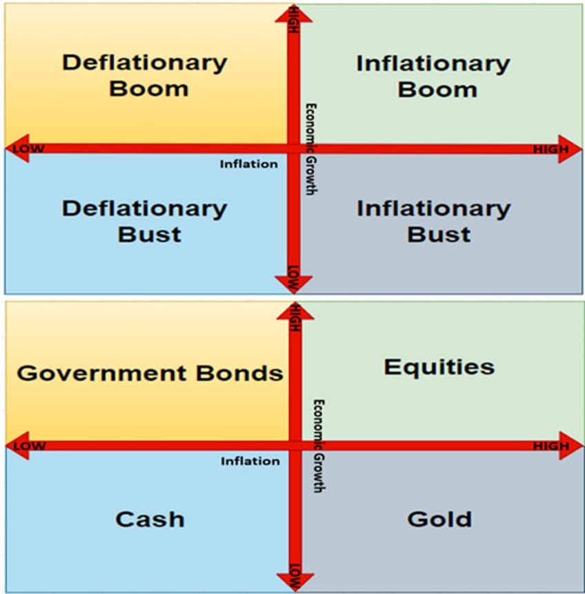
When aligning the four seasons of the business cycle with the four asset classes of the Permanent Browne Portfolio, investors should note that bonds are the preferred asset class during a deflationary boom due to their long-term maturity and the contractual nature of their value. Conversely, bonds underperform the other three asset classes in the Browne Portfolio during inflationary periods, particularly during an inflationary bust, as their long duration and fixed-income characteristics negatively affect performance in such an environment.
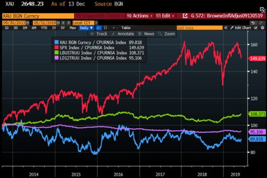
This preference for bonds over cash during a deflationary boom is evident from the CPI-adjusted performance of the four asset classes during the most recent deflationary boom in the US economy, spanning September 2013 to May 2019. During this period, still fresh in the minds of older investors, bonds were the second-best asset class on an inflation-adjusted basis, trailing only equities but significantly outperforming cash and gold.
CPI adjusted return in USD of Gold (blue line); S&P 500 index (red line); Bloomberg US Ag Total Return Index (green line); Bloomberg US Treasury Bills 1-3 months Index (purple) between 30th September 2013 and 31st May 2019.
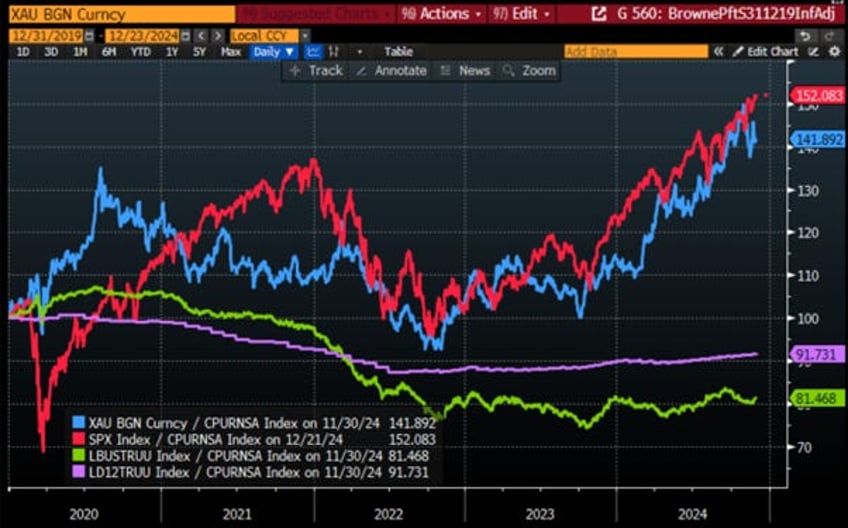
Over the past four years, the 2020s have brought significant lifestyle changes and the weaponization of USD assets, fuelling financial conflicts, higher government spending, and structurally higher inflation. On a CPI-adjusted basis, US investors have seen gold and equities (e.g., the S&P 500) deliver strong, positive real returns, while cash and bonds have lost value on a CPI adjusted basis as the business cycle shifted between inflationary booms and busts.
CPI adjusted return in USD of Gold (blue line); S&P 500 index (red line); Bloomberg US Ag Total Return Index (green line); Bloomberg US Treasury Bills 1-3 months Index (purple) since 31st December 2019.
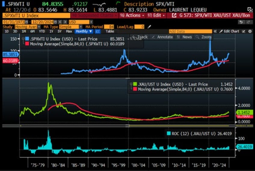
Over a longer time horizon, it becomes clear to anyone analysing a chart that bonds outperform gold during periods of economic deflation, whether in a deflationary boom or a deflationary bust.
Upper Panel: S&P 500/Oil ratio (blue line); 84 months Moving Average of the S&P 500/Oil ratio (red line); Second Panel: Gold/Bond ratio (green line); 84 months Moving Average of the S&P Gold/Bond ratio (red line); Lower panel: 12-months Rate of Return of Gold to Bond Ratio.
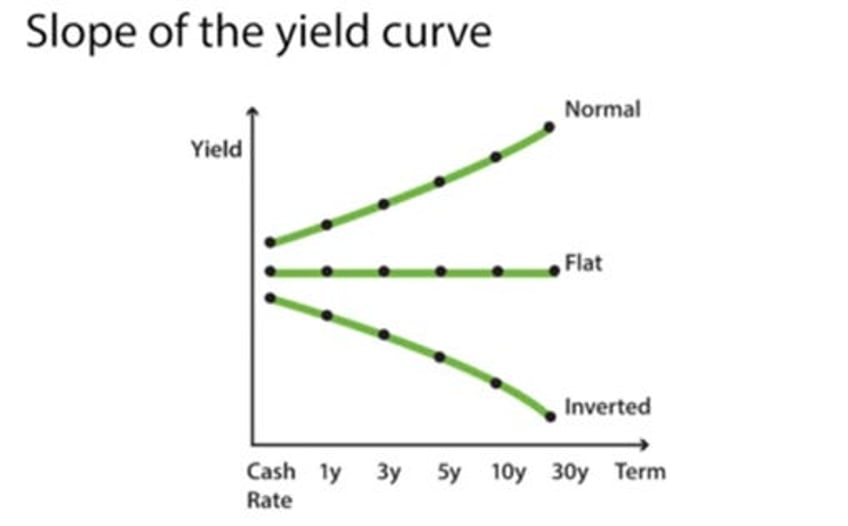
Bond investors understand that the movement and shape of the yield curve can be interpreted by some economists as a leading indicator of the business cycle's evolution. A yield curve is a line that plots the yields or interest rates of bonds with equal credit quality but different maturity dates. The slope of the yield curve helps predict the direction of interest rates and the potential economic expansion or contraction. Yield curves generally take one of three shapes: normal (upward-sloping), inverted (downward-sloping), or flat.
The yield curve is seen as a vital indicator of economic activity, inflation, and interest rate trends, reflecting market expectations. A steep upward slope signals economic growth and higher future rates, while an inverted curve, with short-term rates exceeding long-term ones, often predicts a recession and potential rate cuts. Rising yields suggest inflationary pressures, while a flattening curve points to subdued inflation. The curve also helps gauge Federal Reserve policy, with steepening often prompting rate hikes and inversion leading to cuts.
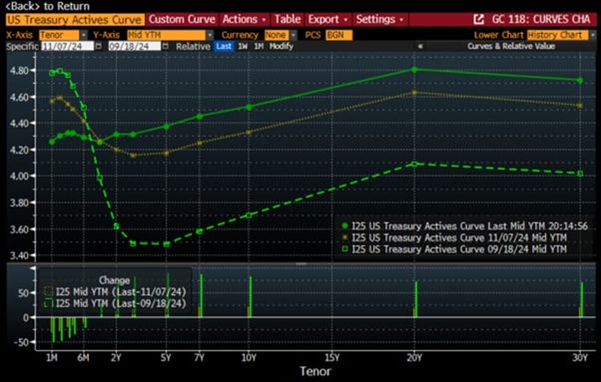
While the FED claims victory over inflation since its summer retreat in Wyoming, its control is limited to short-term rates via the FED Funds rate. Longer-term yields, driven by the bond vigilantes, influence business, mortgage, and auto loan rates. In a stark contract with the narrative that the fight against inflation is a ‘mission accomplished’, since the FED’s pivot on September 18th, the 10- and 30-year yields have risen over basis points, with an additional -basis-point increase following the November FOMC meeting.
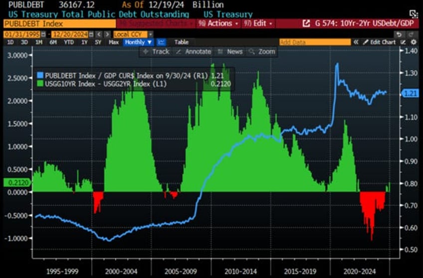
A key metric tracked by Wall Street is the spread between the 10-year and 2-year yields. Since last September, this curve has dis-inverted. Investors with some perspicacity will note that the spread historically widens during periods of rising debt-to-GDP ratios, as bond vigilantes demand higher yields at the long end of the curve to account for increased default risk. It is indeed well known that most governments spend like ‘drunken sailors’, without accountability to their citizens or lenders, face this dynamic, as their debt is essentially ‘unsecured’ except through tax increases. The goal of most governments has never been to repay their debts but to roll them over by refinancing at longer maturities, as the common approach is to ‘kick the debt can down the road’ while focusing on re-election.
US Public Debt to GDP ratio (blue line); US 10-Year Yield – US 2-Year Yield (histogram).
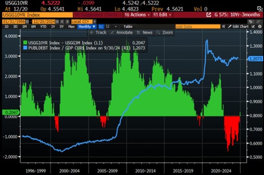
While most investors are focusing on the spread between the 10-year and 2-year yields, the spread between the 10-year yield and the 3-month yield is much more important for financial markets, as it drives the attractiveness of carry trades to buy longer-term debt. Due to recent FED decisions to cut the Fed Funds Rate while the U.S. economy remains in an inflationary boom, the spread between the 10-year yield and the 3-month yield has just dis-inverted, after being inverted since November 2022.
US Public Debt to GDP ratio (blue line); US 10-Year Yield – US 3-Month Yield (histogram).
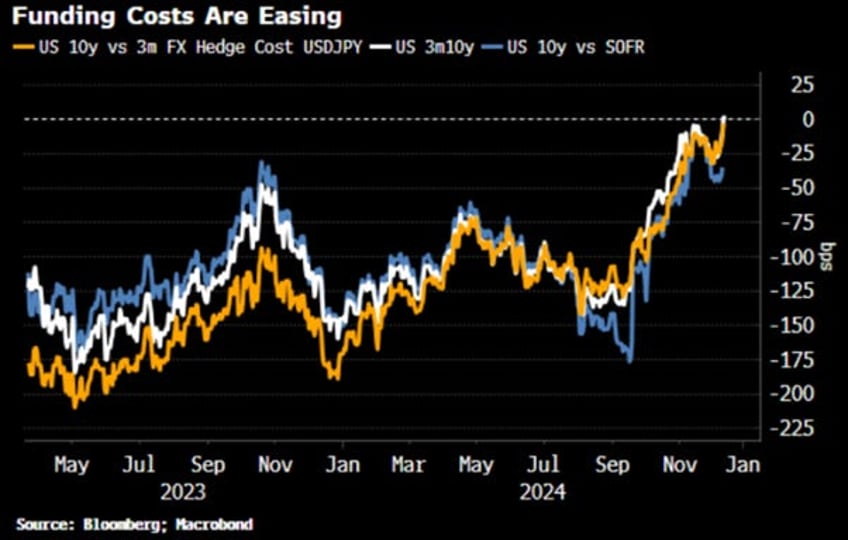
Bonds are typically bought and funded at short-term rates, usually closer to three months than two years. With 10-year yields now higher than three-month rates, carry traders are more incentivized to buy longer-term Treasuries. This applies not only to domestic traders but also to foreign ones, who hedge FX risk based on short-term U.S. rates. That’s why the US 10-year yield versus the three-month cost for a Japanese investor to hedge the yen closely tracks the US 10-year yield versus the three-month rate. The yet to dis-invert curve is the 10-year yield versus SOFR.
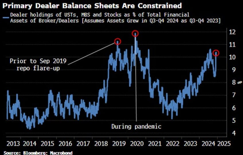
This matters because primary dealer balance sheets have become increasingly congested with securities inventory, including not just Treasuries, but MBS, stocks, and other assets. As a percentage of total assets, their holdings are near levels last seen during the pandemic, when a wave of Treasury selling overwhelmed dealers, and just before the repo market flare-up in 2019.
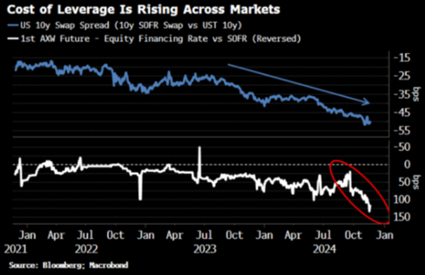
When dealer balance sheets are constrained, leverage costs rise, as seen in more negative swap spreads and higher equity financing costs. The risk is that dealers may have to reduce or withdraw leverage, causing abrupt market unwinding. While this hasn't happened yet, it remains a risk as stocks continue to rise. The dis-inversion of the 3m10y curve is gradual, but it should increase demand for Treasuries, helping dealers reduce inventory and ease market risk, leading to lower swap spreads and financing costs.
That likely explains why, aside from its partisan agenda, the FED began cutting rates in September. By lowering the FED Funds rate, the FED provides a way to ease pressure on primary dealers' balance sheets without being forced to restart QE officially, thus helping contain the impact of the bond vigilantes at the long end of the curve while the US remains in an inflationary boom.
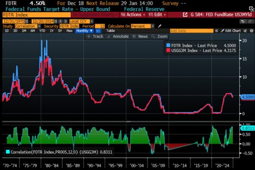
FED Fund Rate (blue line); US 3-Month Yield (red line) & Correlations.
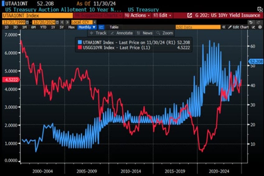
While the dis-inversion of the 3m10y curve may help the US government deal with the return of the bond vigilantes, the reality is that in 2025, the U.S. government will need to refinance $8.0 trillion of its debt. With a new Treasury secretary, it is anyone’s guess how he will redistribute the maturity breakdown of US debt in an environment still under the watchful eye of the bond vigilantes. Historically, a higher allotment to 10-year debt has been correlated with higher 10-year yields.
US Treasury Auction Allotment 10-Year Notes (blue line); US 10-Year Yield (red line).
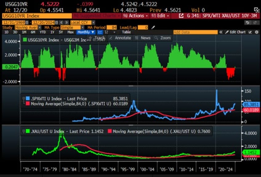
For the business cycle, a positive 3m10y curve has historically been associated with periods of economic booms, with the recent dis-inversion of this yield curve potentially being an anomaly caused by the recent strong issuance of short-dated bonds by the US government.
Upper Panel: Spread between US 10-Year Yield and US 3-months Yield (histogram): Middle Panel: S&P 500/Oil ratio (blue line); 84 months Moving Average of the S&P 500/Oil ratio (red line); Lower Panel: Gold/Bond ratio (green line); 84 months Moving Average of the S&P Gold/Bond ratio (red line).
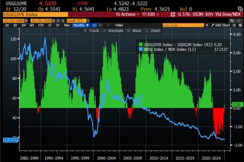
For equity investors, the dis-inversion of the 3m10y curve has historically signalled the trigger for the Dow Jones to outperform the Nasdaq over the past 35 years. In this context, while YOLO investors may lack the financial knowledge to understand the significance of the recent dis-inversion of the 3m10y curve, investors will take note and adjust their portfolios accordingly.
Relative performance of Dow Jones to Nasdaq rebased at 100 as of 31st December 1985 (blue line); Spread between US 10-Year Yield and US 3-Monhts Yield (histogram).
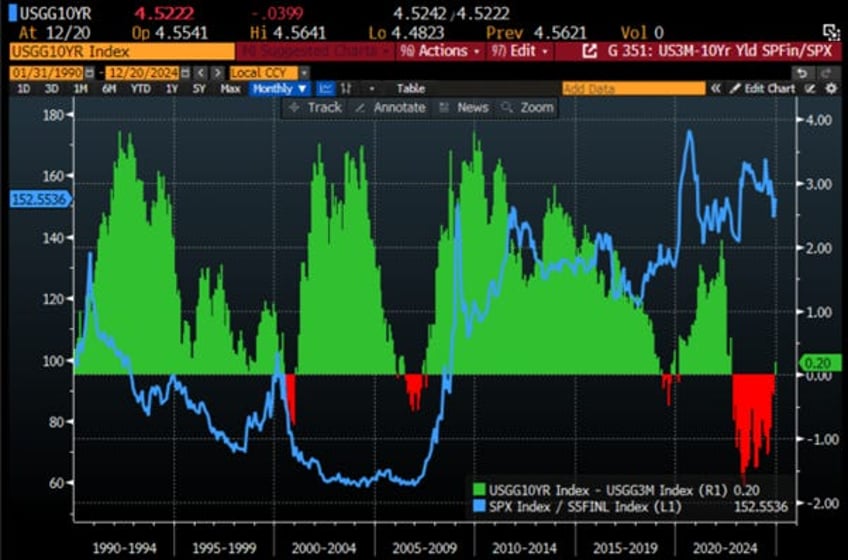
One sector particularly impacted by changes in the shape of the yield curve is undoubtedly the financial sector. As the 3m10y curve dis-inverts, savvy investors will note that such dis-inversions in the past have been synonymous with underperformance of the S&P financial sector relative to the S&P 500 index. With tariffs set to be implemented, which will inevitably impact the economy and increase the risk for now ‘too big to rescue’ banks, the recent dis-inversion of the yield curve is an additional reason to the long lists of economic indicators to stay away from the financial sector in general and the banks in particular.
Relative performance of S&P 500 index to S&P 500 Financial index rebased at 100 as of 31st January 1990 (blue line); Spread between US 10-Year Yield and US 3-Monhts Yield (histogram).
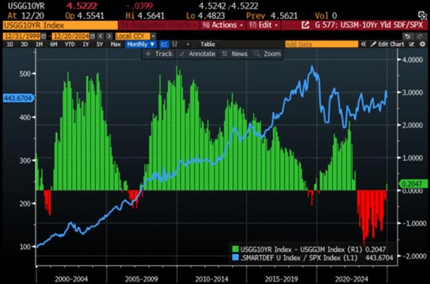
Savvy investors know that in a world with geopolitical risks, including not only trade wars but also kinetic wars, the best-balanced equity portfolio to own since the start of this decade has been one with equal-weight allocations between the IT, Energy, and Aerospace & Defence sectors, which can be called the Smart Defence Equity Portfolio. Looking at the impact of the dis-inversion of the 3m10y curve on the relative performance of the Smart Defence Equity Portfolio versus the S&P 500, there has been little to no correlation between the shape of the yield curve and the relative performance of this portfolio against the S&P 500 index.
Relative performance of Smart Defence Equity Portfolio to S&P 500 index rebased at 100 as of 31st December 1999 (blue line); Spread between US 10-Year Yield and US 3-Monhts Yield (histogram).
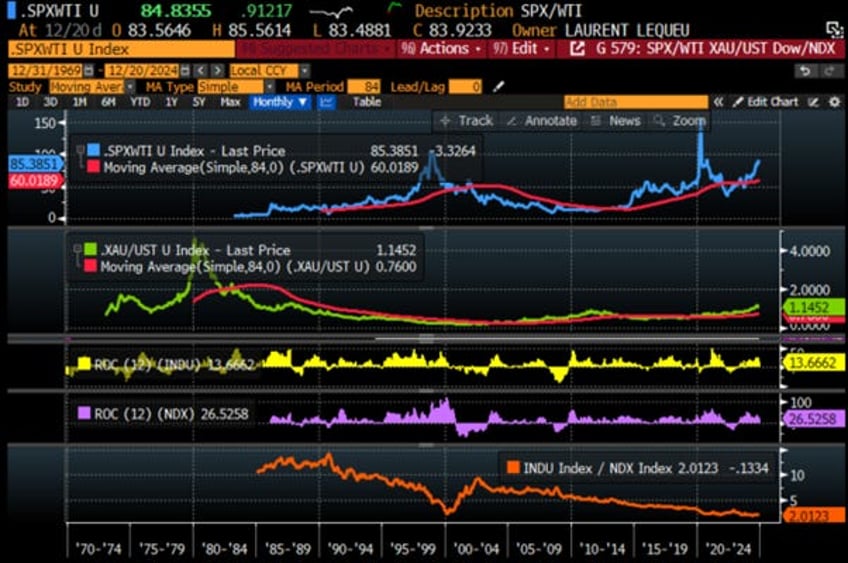
While the shape of the yield curve may be important for how the FED and the Treasury try to mitigate the inevitable impact of the bond vigilantes on government financing costs, and ultimately, on businesses and consumers seeking loans, savvy investors know that two market ratios determine the stage of the business cycle: the S&P 500 to Oil ratio and its position against its 7-year moving average, and the Gold to US Treasury ratio and its position against its 7-year moving average. Equity investors will note that when the US economy is in an inflationary boom, as it has been since October 2023, the Nasdaq outperforms the Dow Jones. However, as savvy investors know, the risk of the US transitioning from an inflationary boom to an inflationary bust is rising with the implementation of new trade policies under the 47th US president. In such an environment, as seen between January 2022 and October 2023, the Dow outperforms the Nasdaq.
Upper Panel: S&P 500/Oil ratio (blue line); 84 months Moving Average of the S&P 500/Oil ratio (red line); Second Panel: Gold/Bond ratio (green line); 84 months Moving Average of the S&P Gold/Bond ratio (red line); Third Panel: Dow Jones 12-months Rate of Change (yellow histogram); Fourth Panel: Nasdaq 100 12-months Rate of Change (purple histogram); Lower Panel: Relative performance of Dow Jones to Nasdaq index (orange line).
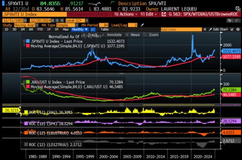
In a nutshell, if the rising scenario of a 'Trump Stagflation' or the US economy transitioning from an inflationary boom to an inflationary bust occurs within the next 12 months, the recent dis-inversion should be short-lived unless the FED keeps ignoring the reflation that lies ahead. In any case, as the US economy remains in an inflationary environment, bonds are still expected to be the worst asset class among the four asset classes of the Permanent Browne Portfolio.
Upper Panel: S&P 500/Oil ratio (blue line); 84 months Moving Average of the S&P 500/Oil ratio (red line); Second Panel: Gold/Bond ratio (yellow line); 84 months Moving Average of the S&P Gold/Bond ratio (red line); Third Panel: Gold price adjusted to US CPI 12-months rate of change (yellow histogram); Fourth Panel: S&P 500 adjusted to US CPI 12-months rate of change (purple histogram); Fifth Panel: Bloomberg US Agg Bond index adjusted to CPI 12-monhts rate of change (orange histogram); Lower Panel: Bloomberg US T bills 1-3 Months adjusted to US CPI 12-months rate of change (grey histogram).
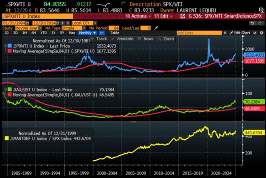
This brings us to the conclusion that investors should continue to avoid bonds within the four asset classes of the Browne Portfolio, as the US economy is still in an inflationary boom. The implementation of widespread tariffs and tighter immigration policies will likely push the US economy into an inflationary bust rather than a deflationary boom or bust in the foreseeable future. Investors holding more than 25% of their portfolio in bonds now expect the US economy to return to a deflationary mode within the next 12 months, a scenario that is unlikely unless the Department of Government Efficiency achieves its $2.0 trillion cut in government spending and Donald Trump miraculously ends the forever bankers’ wars in Eastern Europe and the Middle East. Anyone with a modicum of common sense would assign a 0% to 10% probability to this deflationary scenario in the near future. In this context, investors can still buy the dip in the equity market and focus on companies within the Smart Defence Equity Portfolio that have strong balance sheets and positive free cash flow generation. The Smart Defence Portfolio remains the best way for investors to reduce volatility in their equity allocations and navigate what is expected to be a much more volatile year ahead for financial markets. However, investors should remember that during an inflationary bust, they will need to reduce their equity allocation and increase their allocation to gold and other real assets.
Upper Panel: S&P 500/Oil ratio (blue line); 84 months Moving Average of the S&P 500/Oil ratio (red line); Middle Panel: Gold/Bond ratio (green line); 84 months Moving Average of the S&P Gold/Bond ratio (red line); Lower Panel: Relative Performance of Smart Defence to S&P 500 Index (yellow line).
Investors should also never forget that, in the worst-case scenario of an inflationary bust, gold, not government bonds, remains the antifragile asset to hold. Among equities, investors will need to shift from energy-consuming sectors like IT to energy-producing sectors like oil and gas. This shift will occur in an environment where investors must increasingly prioritize the Return OF Capital over the Return ON Capital.
Read more and discover how to position your portfolio here: https://themacrobutler.substack.com/p/skyfall-ahead
If this report has inspired you to invest in gold and silver, consider Hard Assets Alliance to buy your physical gold:
https://hardassetsalliance.com/?aff=TMB
At The Macro Butler, our mission is to leverage our macro views to provide actionable and investable recommendations to all types of investors. In this regard, we offer two types of portfolios to our paid clients.
The Macro Butler Long/Short Portfolio is a dynamic and trading portfolio designed to invest in individual securities, aligning with our strategic and tactical investment recommendations.
The Macro Butler Strategic Portfolio consists of 20 ETFs (long only) and serves as the foundation for a multi-asset portfolio that reflects our long-term macro views.
Investors interested in obtaining more information about the Macro Butler Long/Short and Strategic portfolios can contact us at
Unlock Your Financial Success with the Macro Butler!
Disclaimer
The content provided in this newsletter is for general information purposes only. No information, materials, services, and other content provided in this post constitute solicitation, recommendation, endorsement or any financial, investment, or other advice.
Seek independent professional consultation in the form of legal, financial, and fiscal advice before making any investment decisions.
Always perform your own due diligence.

