The US yield curve should continue to steepen, with increased Treasury-bill issuance likely one of several supportive factors. In showing this, we’ll get to a deeper problem in markets analysis: the limitations of correlation.
Finally, after one of the deepest inversions yet seen, the yield curve looks like it is on a sustainable steepening path. I expect that trend to continue, with one of the supports - as I argued in a recent post - the increase in bill issuance. That prompted a riposte from Cameron Crise, arguing the correlation was low, and that anyway, correlation does not imply causation.
Both fair points, but they offer up the opportunity to look at correlation more closely, a tool used freely, frequently and often misguidedly in market analysis.
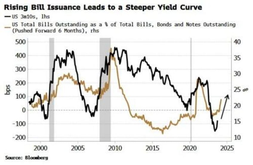
The chart that Cameron objected to is below. It shows the yield curve versus T-bills outstanding as a proportion of total government debt outstanding. As he pointed out, the correlation between the two series, at ~25%, is quite low.
But it is important to take the lead into account. Two lines on a chart with no lead may explain, but they don’t predict. Two series where one leads the other, assuming no spurious correlation, can predict - which has considerable more utility for investors.
In the chart above the T-bills series is pushed forward by six months. Recalculating the correlation using the series correctly offset shows it rises to 36%.
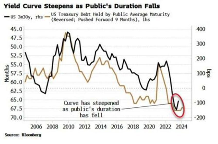
This is still on the low side, and doesn’t demonstrate causality. But we can better see the relationship by looking at the yield curve versus the average duration of Treasury debt held by the public. As the chart below shows, the public’s average duration of debt held has done a decent job of tracking the yield curve – with a nine-month lead – since 2008 and the GFC.
The correlation of the annual changes is -51%, with a t-stat of ~-5 in the linear regression. (As an important side note, we should always do correlations on changes not levels to reduce the impact of drift co-linearity).
Cameron put forward another relationship between net new duration (10y versus 2y issuance) and the yield curve, showing they are positively rather than negatively related, and having a still-on-the-low-side correlation of +44%.
Nonetheless, I prefer the average duration held by the public as a yield-curve predictor, not only due to the higher correlation, but as: a) it gives information on net issuance across the whole curve; b) it negates Federal Reserve ownership effects; and c) the relationship gives a lead rather than being coincident.
But there are two further important points to make.
The first is causality. As Cameron reminded us, correlation does not imply causation. A -51% correlation is not too bad, but even a 100% correlation would not imply causality. In fact, no mathematical technique can prove causality.
The only way to indicate causality is to have a causal theory. One offered here is that demand for shorter-term debt and bills is elastic, and when Treasury increases its shorter-term issuance, the extra supply creates more demand at the front of the curve relative to the back, and the curve steepens as average duration falls - as is happening today.
Yet an even bigger issue here concerns the limitations of the correlation measure itself that are often not appreciated. In markets, we are most interested in turning points. It is here where we get the most abrupt changes, and it is here where the consensus – which typically linearly extrapolates a trend – is most wrong. It is therefore at turning points we tend to see the biggest moves in risk assets.
But the standard way of calculating correlation (the Pearson coefficient) looks at an average of co-movements relative to each series’ mean. Two series may line up very well at major turning points, but that can easily get diluted by the rest of the data points in the set.
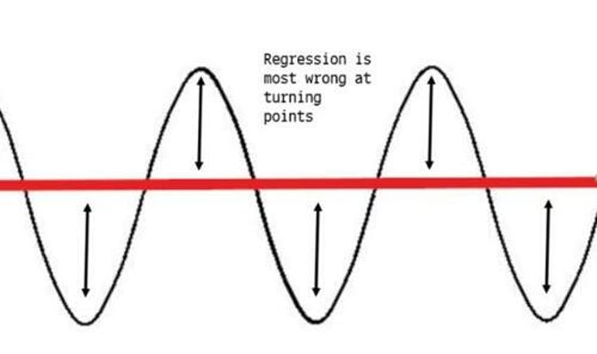
The de-emphasis of turning points can be seen most directly when we think about regressions. The ultimate aim from an investor’s standpoint is to find relationships that lead. Regressions enable us to forecast values for data series. But the most common type used – linear regressions – are ill suited for trying to predict all-important turning points.
Take a a simple sine curve. A naive regression would return a straight line through the middle. Not only is this unhelpful, it is “peak wrong” when you need it most, i.e. at the turning points.
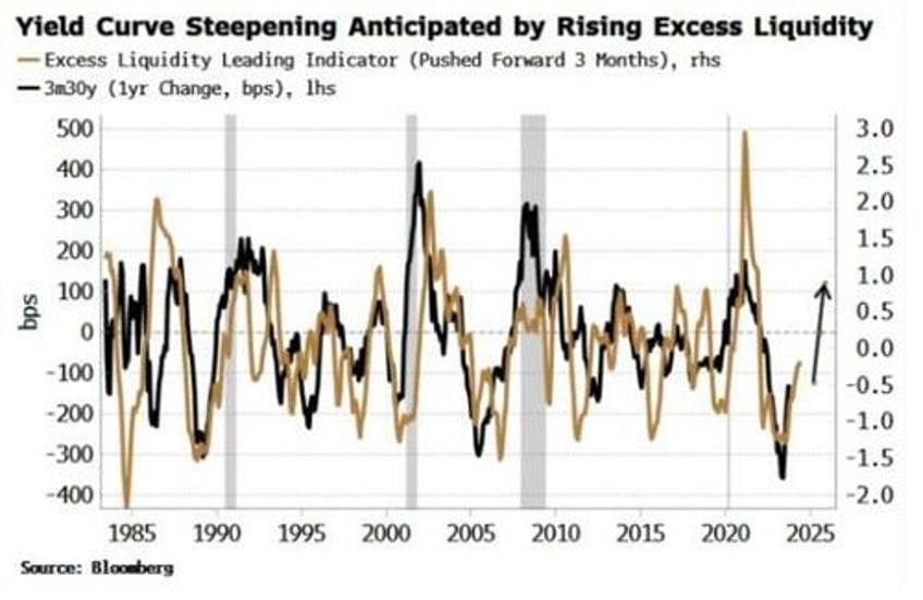
Back to today and the yield curve. As mentioned above, the average duration of Treasury debt held by the public is likely one influence on the yield curve at turning points. But it is important to not make assertions based on only one indicator. In this case a steeper yield curve is also intimated by the rise in global excess liquidity (real money growth minus economic growth).
Here, even though we can visually see many of the turns in excess liquidity lead the turns in changes in the yield curve, the correlation is under 35%. Yet the indicator has been more useful in anticipating the turning points than the low-ish correlation would infer.
Still, no relationships in finance and markets are mono-causal. There is reflexivity and there are feedback loops, as we get in any complex system. The aim of market analysis is to try to shine a light on partial relationships that hopefully help illuminate the bigger picture. As Niels Bohr, founding father of quantum mechanics, put it in the context of science:
“It’s wrong to think the task of physics is to find out how nature is. Physics concerns what we can say about nature”.
It looks like the yield curve should continue to steepen, based on the above analysis. The tacit caveat is that no relationship is perfect and there are no crystal balls. After all, if anyone had the holy grail to make money limitlessly, why would they share it?


