By Simon White, Bloomberg markets live reporter and strategist
Bond yields typically rise after the major data releases of payrolls, ISM and CPI, but in recent years they have risen more after payrolls. Stocks display less bias than bonds after data releases, except after the ISM, which has been consistently positive for the equity market.
The way economic data is released is a Baysian’s dream. Bit by bit, disciples of the Reverend Bayes can update their priors as new information comes in, unlike company data which is released in one go for the quarter. But rather than the market behaving randomly after major economic data is published, it turns out there is often a skew, even after adjusting for the underlying long-term trend in the market.
I thought it would be interesting to see how stocks and bonds behave in the days following the release of the ISM (both services and manufacturing), payrolls and CPI. Specifically, I calculated the average performance of stocks and bonds on the day in each month when a data point is released, and then the average performance on the day after that, then the day after that, and so on for the next 20 days, and then cumulate the returns together.
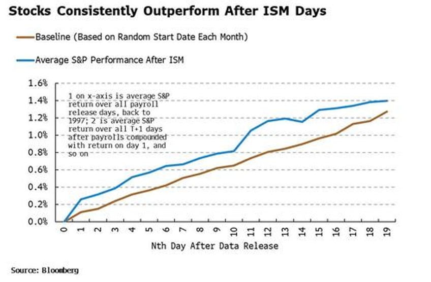
The chart below shows stocks’ average daily compounded return (orange line) after the manufacturing ISM is released each month.
We see a surprising result. Stocks consistently outperform the baseline in the days following the manufacturing ISM’s release, with data going back to 1997. (The blue line in the chart shows the baseline S&P return by selecting a random day each month and calculating the mean returns over these dates. Then using Monte Carlo simulation repeat this process with different random dates several times, and take the average returns across the simulations.)
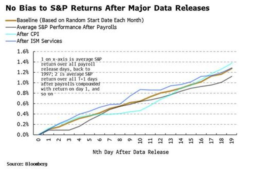
There is not the same bias after the services ISM, payrolls or CPI data are released. The compound average S&P returns for these three oscillate around the baseline return (blue line in chart) and do not show the persistent positive skew as with the manufacturing ISM.
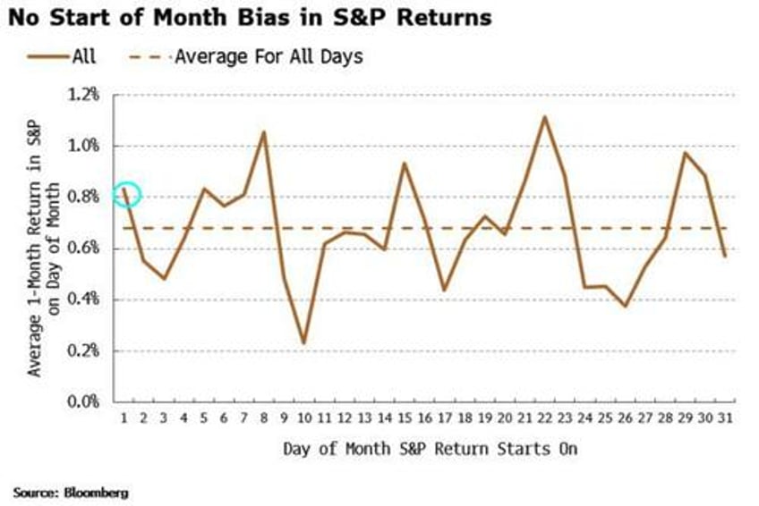
The ISM is released near the very start of each month, so there is perhaps bias creeping in here. New money and rebalancing flows could influence returns that start near the beginning of month. But that’s not the case. The average one-month return in the S&P starting on the first day of the month, for all such one-month returns going back to 1997, is nowhere near the highest reading (that accolade goes to the 22nd day of the month, with the 8th not far behind – I can’t think of an obvious reason why).
The effect therefore looks non-trivial. But what explains it? It’s probably a combination of things.
Firstly, the ISM is almost always the first major economic data point each month giving an update for the economy. That means it sets the tone for growth - which on average is positive and thus friendly for stocks - and often does so ahead of other data released later in the month or quarter.
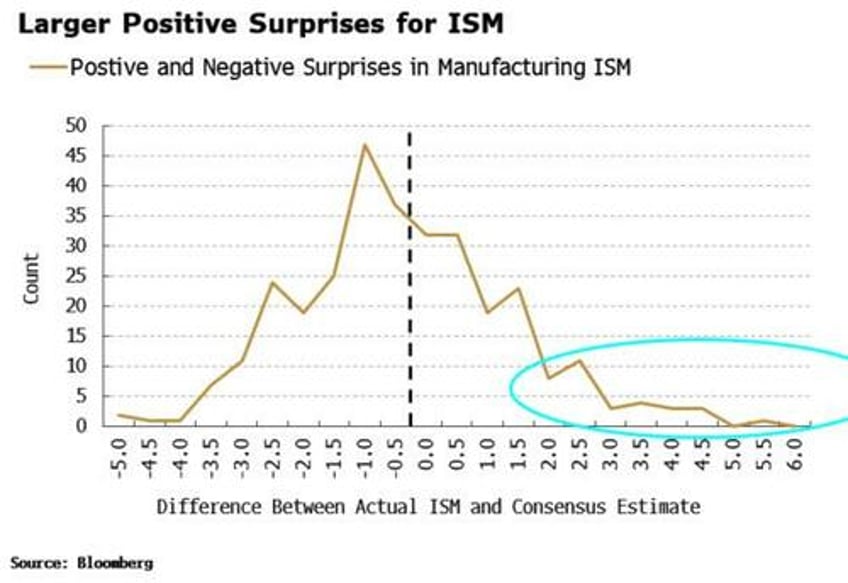
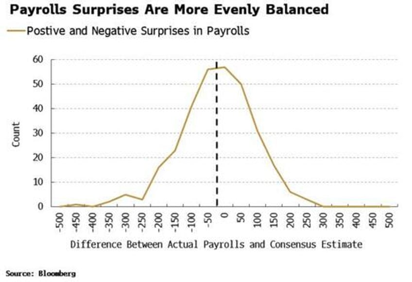
Secondly, although the ISM more often disappoints to the downside versus expectations, it is above the 50 level - which marks expansion - more than two-thirds of the time (going back to 1997). Moreover, there is a longer right-tail for positive outcomes, i.e. the ISM surprises to the upside with a greater magnitude than to the downside.
This is more pronounced than for payrolls, where the magnitude of positive and negative surprises is much more evenly balanced.
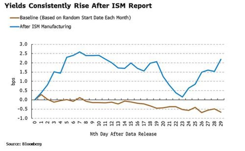
Thirdly, yields display a consistent positive bias after the ISM is released. The cumulative yield move is persistently higher than the baseline blue line in the chart below (the baseline is again based on a random start day each month and is intuitively consistent with lower yields, given they have mainly been falling over the last quarter century).
Stocks and bonds have been negatively correlated for most of the post-1997 period, so rising yields went hand in hand with rising equities. Higher yields, prior to inflation’s return in this cycle, were a sign of a strengthening economy and were therefore stock-positive.
The effect is again much more pronounced for the ISM, with yields having a slight positive bias after payrolls, and a slight negative one after CPI.
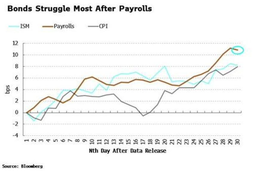
But if we restrict the period looked at from 2020 to the present, the picture radically changes. Yields, given they have on net risen through this period, are higher for each of the types of data. However, they don’t exhibit the largest positive bias after ISM - nor or even after CPI which at one point was over 9% - but after payrolls.
The market has been more focused on the potential for rate hikes as a response to inflation-inducing stronger growth in the post-2020 period, and payrolls – perhaps due to post-pandemic issues with data collection – has remained more consistently robust than the ISM. Stocks have so far bucked the historically positive trend after May’s ISM released on Monday, falling since then, along with yields.
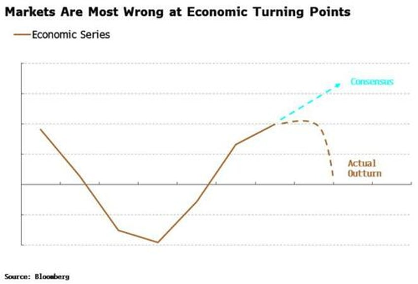
Either way, economic data is crucial for the evolution of asset prices. Yet it’s not the magnitude of the data that has the most impact on prices, but its turning points. Markets seem to have a persistent blind spot for turning points as typically the consensus linearly extrapolates the current trend, which means it is often most wrong when the data turns.
It’s thus at turning points that you often get the biggest moves in risk assets as they have to rapidly integrate a sudden change of trend.
The ISM, as an early-released, monthly indicator that is minimally revised stands a better chance of being first to pick up these turning points. Certainly, the magnitude of some of the surprises in the data compared to consensus shows it can catch the market off guard – more so than payrolls for instance, where there is less skew in positive surprises.

