Fast food joints were once the go-to option for quick, cost-friendly meals, but now, they’re starting to pinch the budget.
Inflation has hit fast food chains hard in the past decade, with many restaurants seeing an average price increase on menu items of more than 50%.
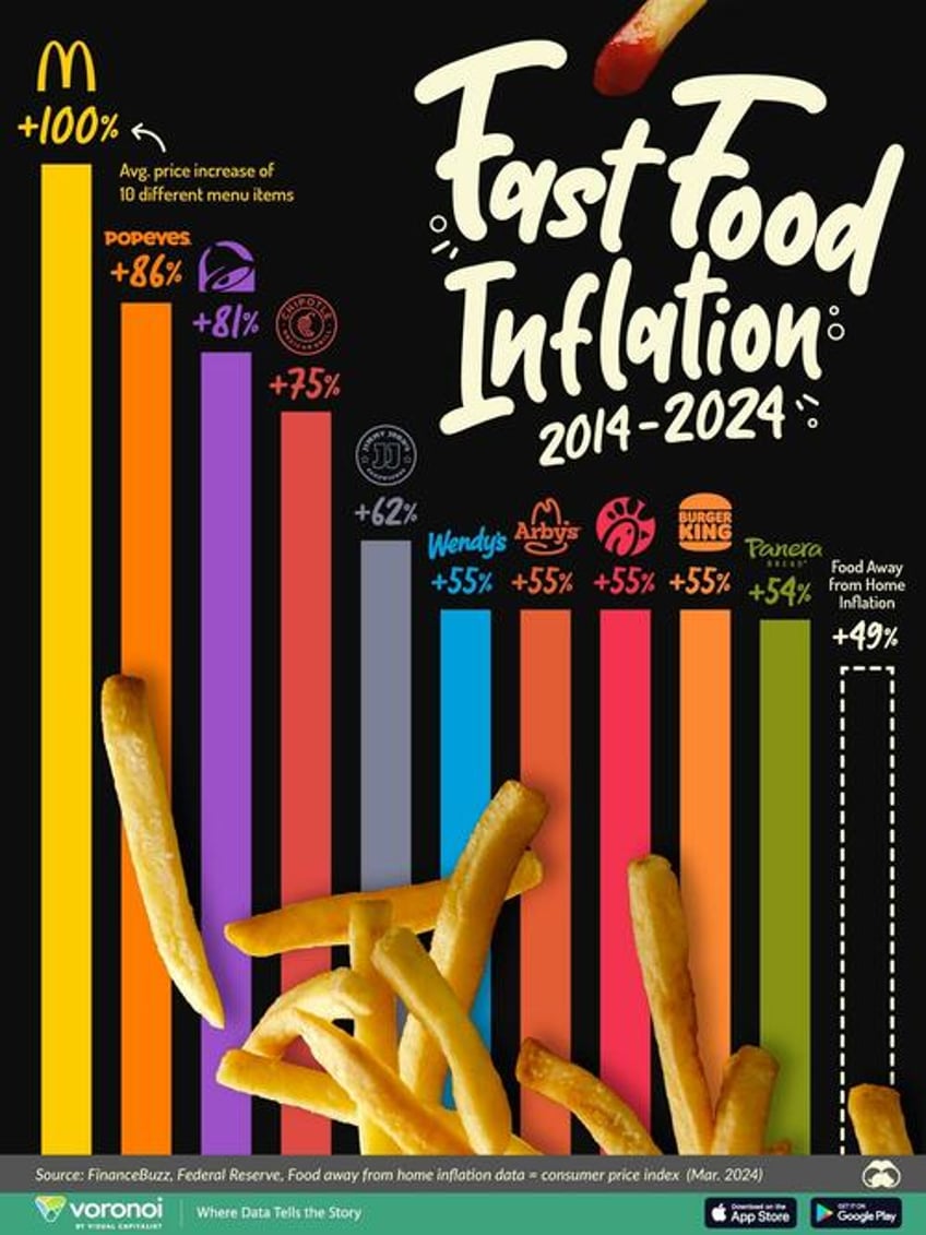
This graphic, via Visual Capitalist's Kayla Zhu, visualizes the average price increase of 10 core menu items from select American fast food chains, as well as the change in the consumer price index (U.S. city average) for food away from home, from 2014 to 2024.
Fast food chain data comes from Finance Buzz and the food away from home figure comes from the Federal Reserve’s March 2024 Consumer Price Index data.
The Rising Costs of Dining Out
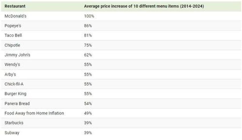
On average, eating at these 10 fast food restaurants has gotten 63% more expensive since 2014, as shown in the table below.
McDonald’s leads the pack in term of fast food inflation, with some of its food items doubling in price since 2014. The company likely took notice of complaints of its rising prices, and is preparing to roll out a month-long, affordable $5 combo meal deal this summer.
While not visualized on the graphic above, Subway and Starbucks were the only two restaurants that had average price increases that were lower than food away from home inflation, at 39% for both restaurants.
As the cost of dining out has increased across the board, with even fast food options surpassing overall inflation, consumers are running out of cheaper alternatives when it comes to having food away from home.


