Something has been going very wrong in the US economy for a very long time, and whatever is going wrong accelerated from 2009 to the present.
Longtime readers know I've covered America's soaring wealth and income inequality for many years, and so I read economist Noah Smith's recent post entitled Working-class wealth is improving with keen interest. I respect Noah's work, which is why I follow his Substack posts.
Here are some excerpts from his commentary:
"One of the truisms many Americans learned during the 2010s that turned out not to be so true is the idea that the wealth of the working class is relentlessly falling behind. The likely reason that people "learned" this "fact" is that it was true up until the financial crisis of 2008, and people didn't recognize it and get mad about until the crash.
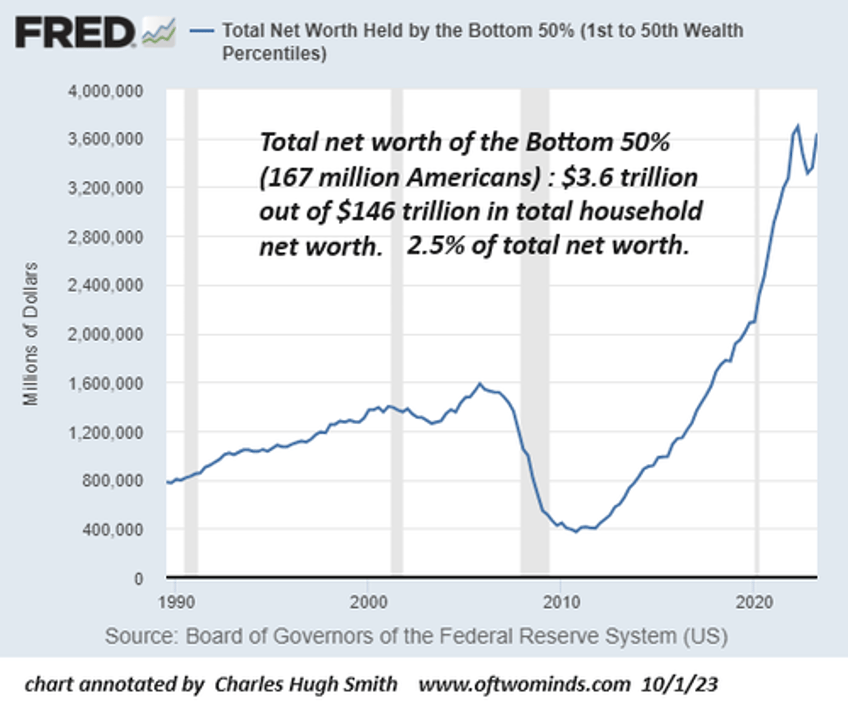
For that we have to turn to the (Federal Reserve's) FRED website. But when we do, we can see that the bottom 50% of households have seen strong wealth growth in real terms since 2012.
Now, 50% of the country's households holding only 2.5% of the wealth is still very dramatic inequality. We should remember that some piece of this is just the life-cycle of wealth -- young people who haven't had time to build wealth and old people who have spent down most of their retirement account will look poor even if they will be comfortable or were comfortable in middle age. But even after accounting for that life-cycle effect, America is going to have very steep wealth inequality.
Trends are important, though. And this trend is a positive one. The fact that working-class wealth has been recovering as a share of America's total wealth for a decade, even as every group has increased its wealth, says that something is going right in the U.S. economy. A rising tide is lifting all boats, and it's lifting the boats at the bottom more than the others."
Data hound that I am, I decided to explore the FRED database for charts that would confirm his no-doubt sincerely issued claim that "The fact that working-class wealth has been recovering as a share of America's total wealth for a decade, even as every group has increased its wealth, says that something is going right in the U.S. economy."
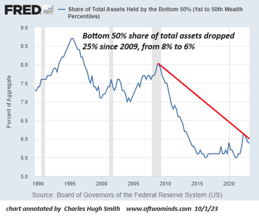
What I found is the exact opposite of his claim: the bottom 50%'s share of total assets and financial assets have fallen sharply since 2009. In the greatest expansion of net worth / assets / wealth in US history, the bottom 50%'s share of this massive expansion of wealth has declined by 25%.
Rather than increase as Noah claimed, the working class's share of America's total wealth has plummeted. Let's look at the data, as depicted on the FRED charts. Let's start with the chart Noah referenced, which does indeed show the wealth (net worth) of the bottom 50% rising smartly over the past decade, from a nadir of less than $1 trillion to $3.6 trillion in 2023:
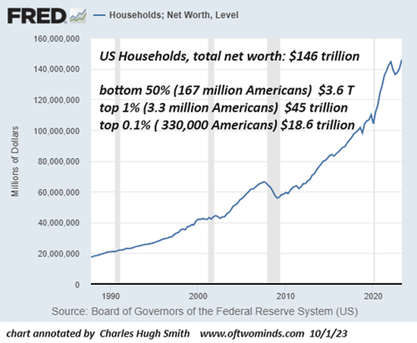
For context, let's look at household net worth, which rose an astounding $90 trillion from $56 trillion in 2009 to $146 trillion in 2023. As the chart above shows, the bottom 50% garnered $3 trillion of this $90 trillion in gains, or 3%. This modest percentage is not supportive of Noah's claim that "A rising tide is lifting all boats, and it's lifting the boats at the bottom more than the others."
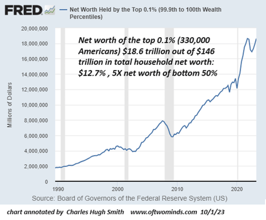
Here we see the 167 million Americans in the bottom 50% own $3.6 trillion, the top 1% --3.3 million Americans--own $45 trillion, a staggering 12.5X the net worth of the bottom 50%.
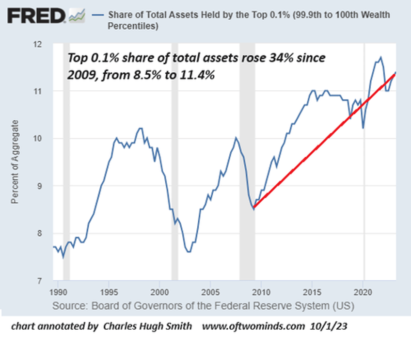
The top 0.1%--330,000 Americans--own $18.5 trillion, an astonishing 5X the net worth of the 167 million Americans in the bottom 50%.
Next, let's look at each segment's share of total assets. The bottom 50%'s share of assets plummeted 25% since 2009, from 8% to 6%.
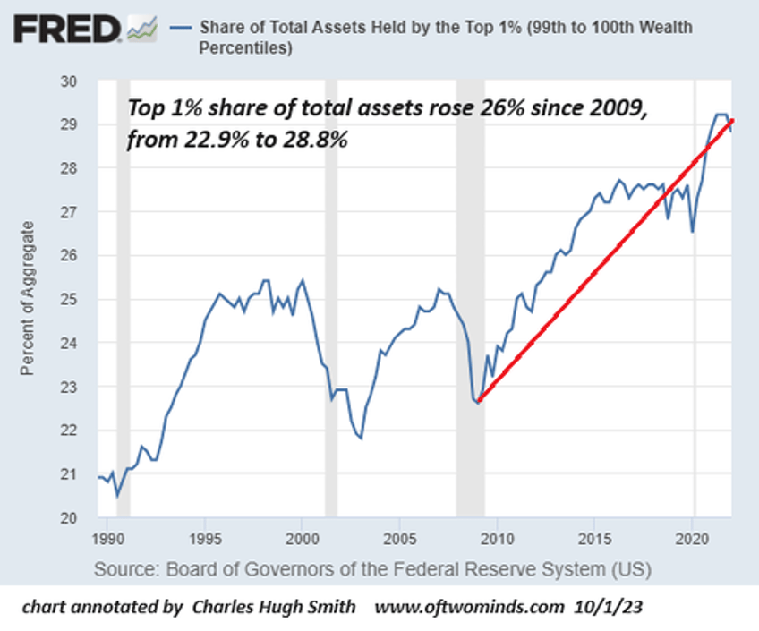
The share of the top 1% soared 26% since 2009:
The share of the top 0.1% skyrocketed 34% since 2009:
These charts show the bottom 50%'s share of America's assets hasn't risen, it's cratered. The rising tide of $90 trillion in additional wealth since 2009 has raised the yachts of the top 1% and the top 0.1% such that the bottom 50% share of assets declined. The bottom 50%'s leaky boat--as measured by their share of assets--actually took on water.
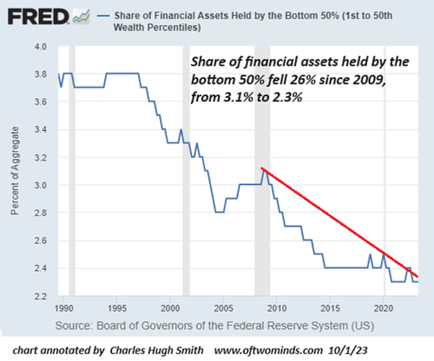
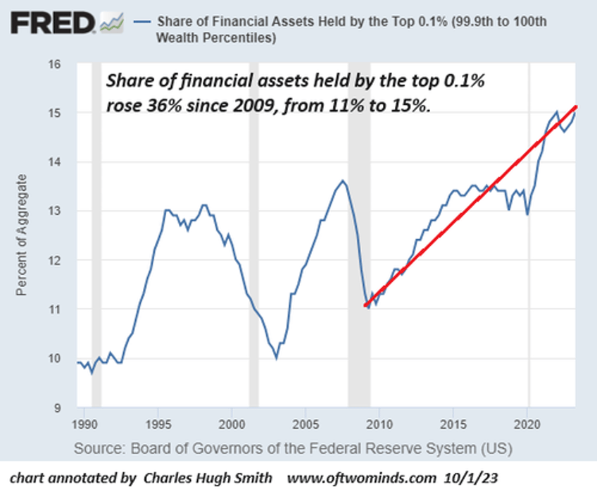
Financial assets are important because financial assets generate income and economic security. let's look at each segment's share of the nation's vast financial assets.
The bottom 50%'s meager share--167 million American's share of the nation's stupendous financial assets--fell 26% from 3.1% to 2.3%--a sliver so thin that it's essentially signal noise.
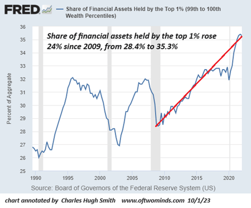
Meanwhile, the top 1%'s share of financial assets rose 24% since 2009, more than 15X the bottom 50%'s share of financial assets.
The top 0.1%'s share of financial assets soared 34%% since 2009, 6.5X the bottom 50%'s share of financial assets.
Noah's claim of "A rising tide is lifting all boats, and it's lifting the boats at the bottom more than the others." is akin to being behind 49-0 in the waning minutes of the fourth quarter and cheerleading the team's increase in total yardage gained from 11 yards in the 2nd quarter to 33 yards in the 3rd quarter--a positive trend.
Noah claimed the financial metrics of the bottom 50% are a positive trend. If we consider the bottom 50%'s share of total assets and financial assets, this claim is not supported by the FRED data.
Noah then extended this claim to an even larger claim that "something is going right in the U.S. economy."
The message of the Federal Reserve's data depicted in the charts is the exact opposite: something has been going very wrong in the US economy for a very long time, and whatever is going wrong accelerated from 2009 to the present.
Those actually living in the bottom 50% (as opposed to jetting around to conferences) might find Noah's ponderings that the bottom 50%'s impoverishment is a statistical anomaly generated by temporarily impecunious youth climbing their way to wealth, and retirees who spent their wealth and are now comfortably impoverished somewhat risible. The reality is more likely mac and cheese from the dollar store prepared in an overcrowded flat or a trailer park and rapacious credit card interest rates and exploitive late fees.
By all means, let's look at the data before making expansive claims.
* * *
My new book is now available at a 10% discount ($8.95 ebook, $18 print): Self-Reliance in the 21st Century. Read the first chapter for free (PDF)
Become a $1/month patron of my work via patreon.com.
Subscribe to my Substack for free

